
Second place in DIELINE Awards 2021
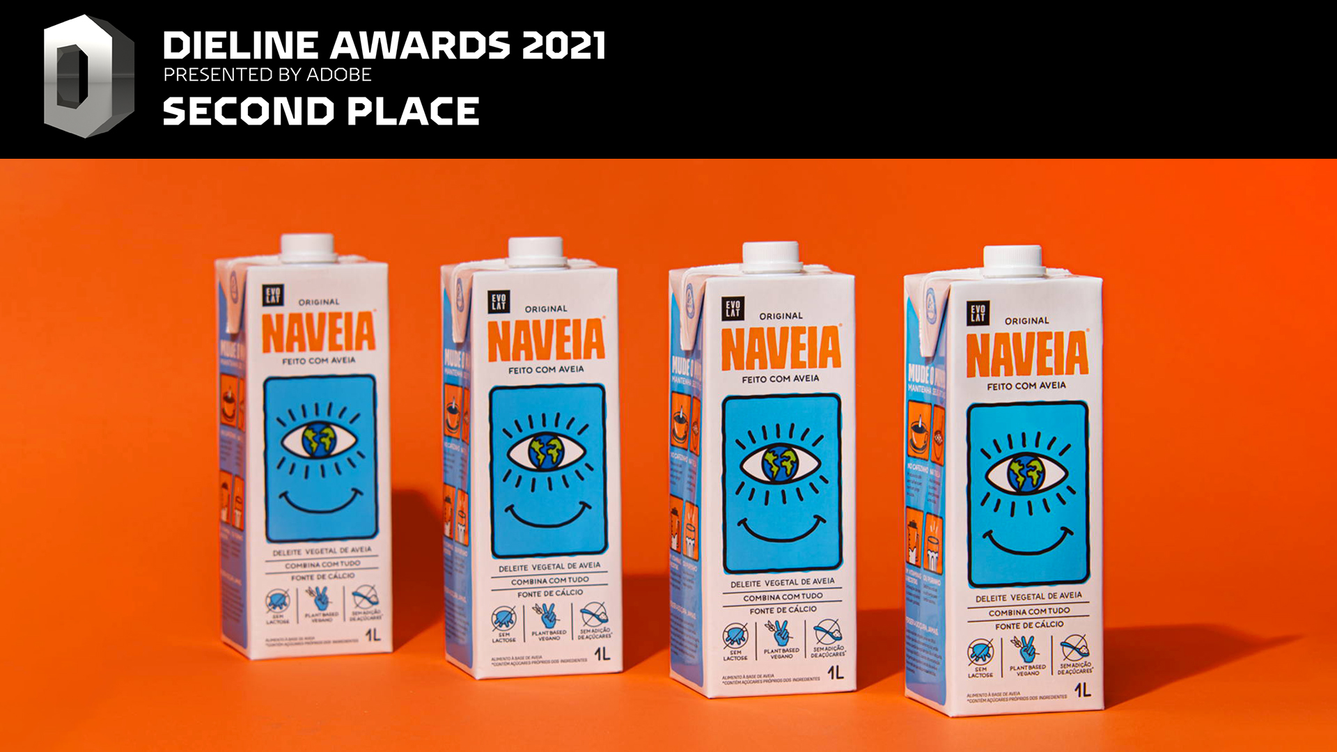
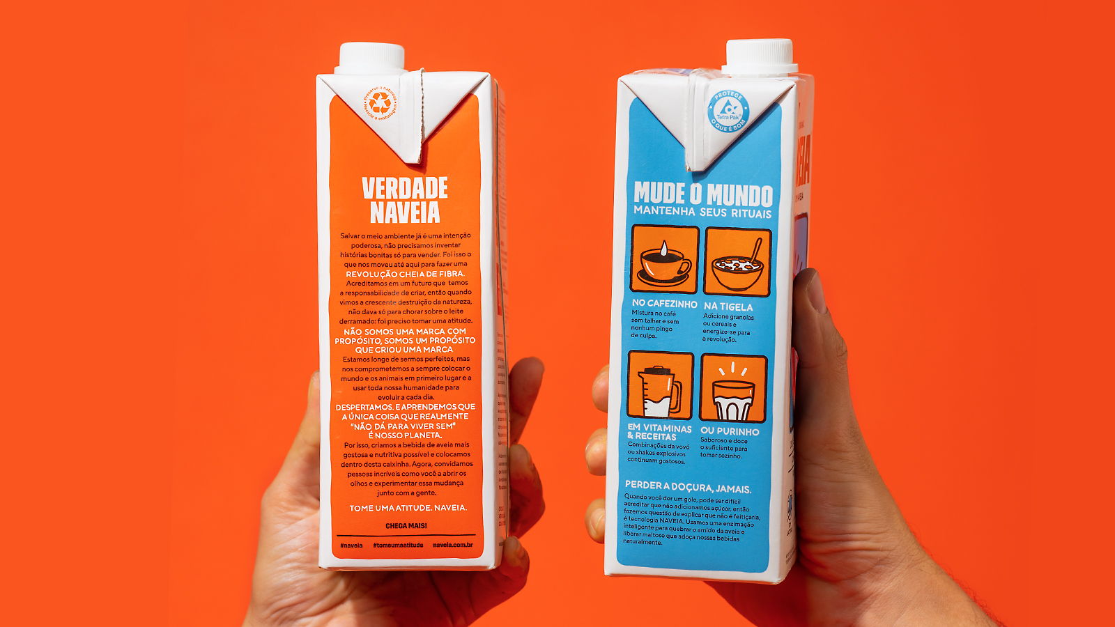
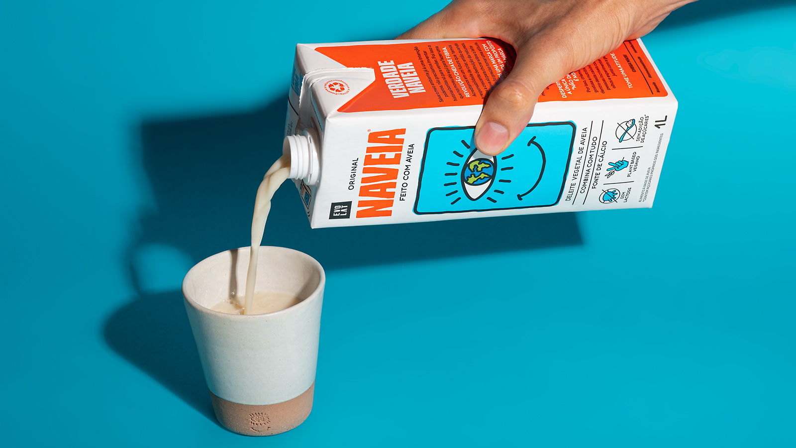
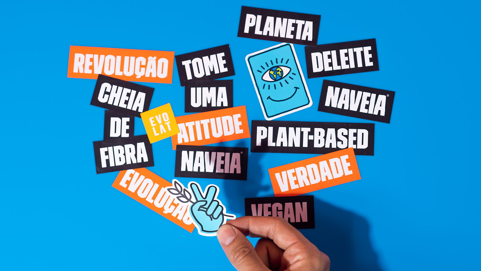
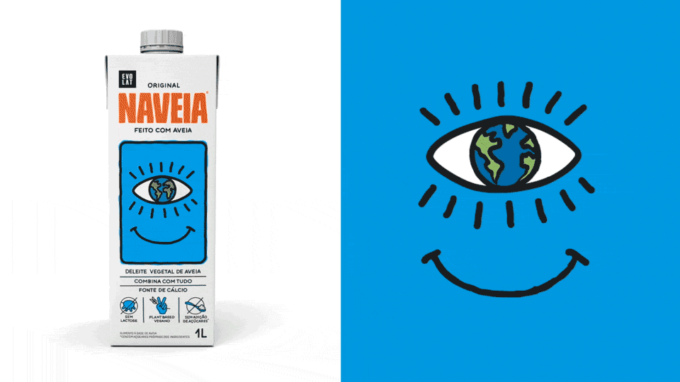
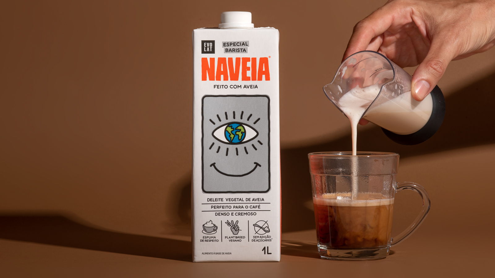
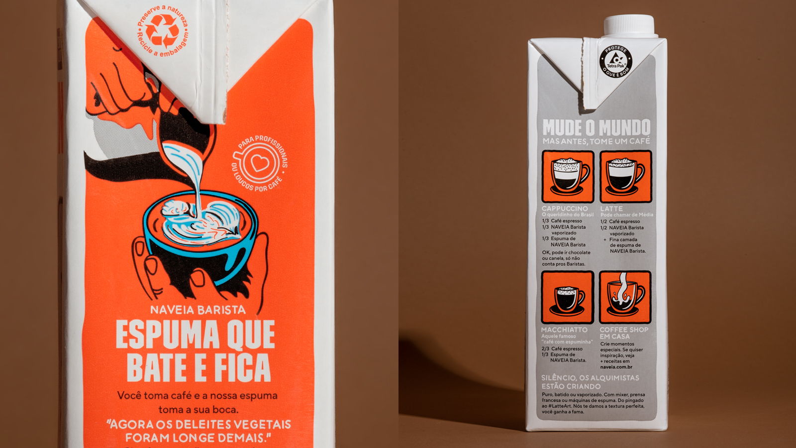
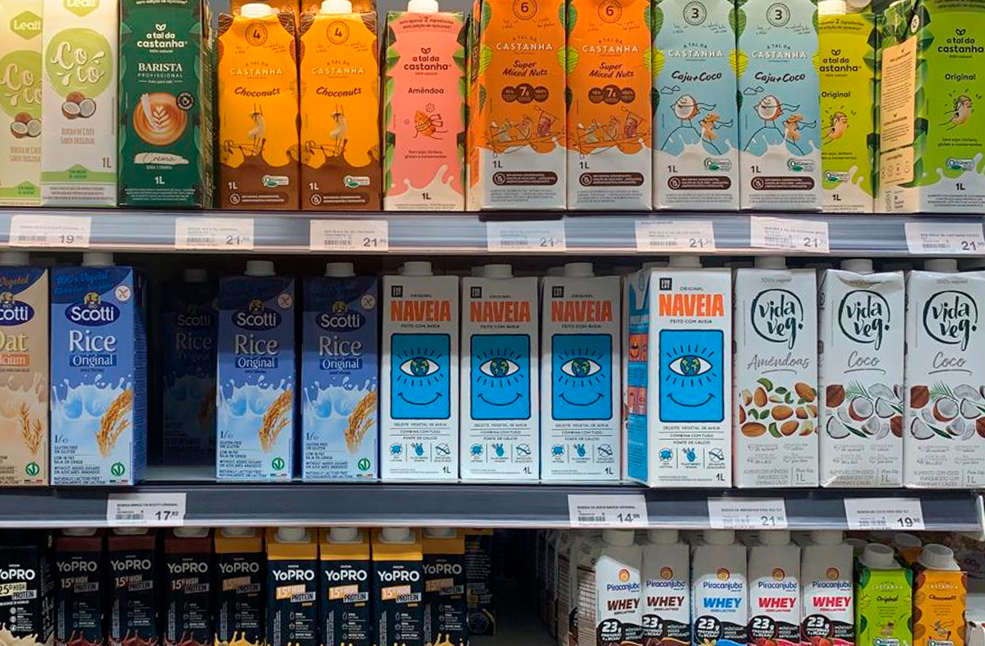
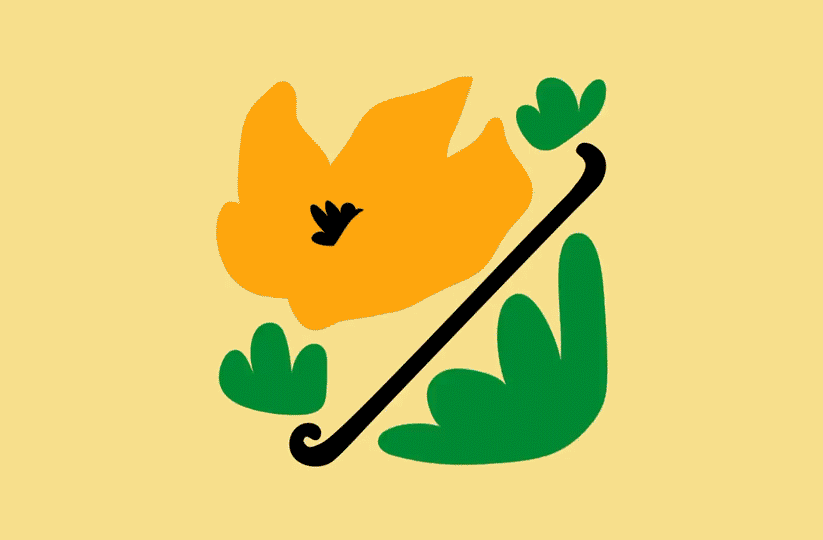
Branding, communication, brand architecture, iconography and packaging design for @naveia. Activism and sustainability are part of the fiber-rich revolution proposed by the brand. We hightlighted the strong positioning of the vegan drink, whose mission is to make people rethink their eating habits. With vegetable milk, Naveia choose the path without guilt, putting the planet and animals first. Take action, experience this change!
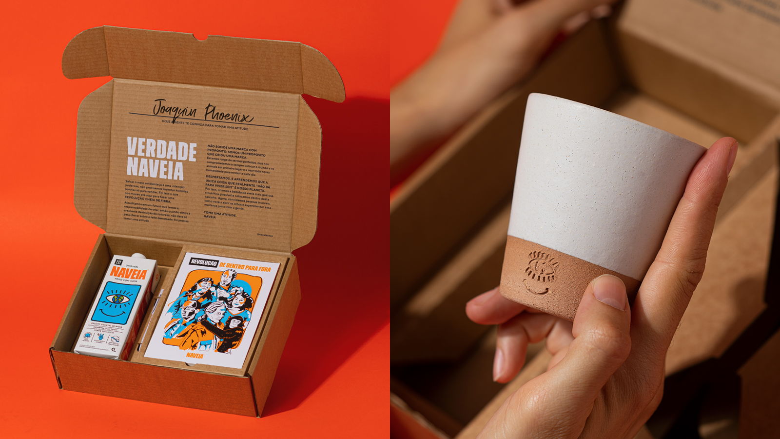
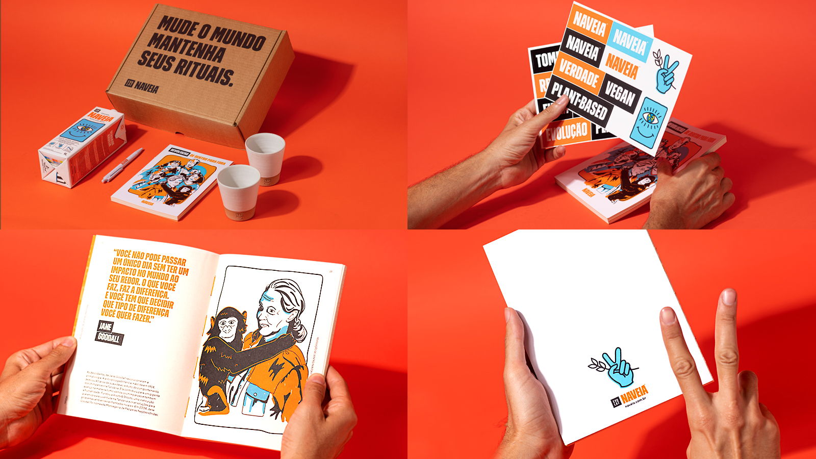
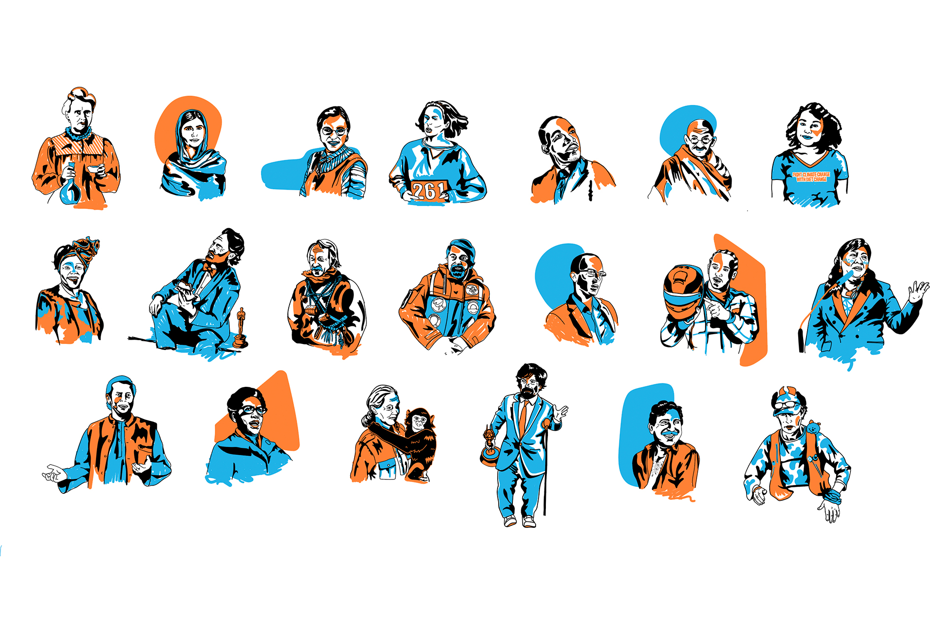
Inspired by activists who left a positive impact on the world, we created a press kit that calls on others to wake up and take action. With an illustrated book celebrating evolutionary stories and a personalized ceramic cup, each ritual with Naveia becomes an invitation to a fiber-filled revolution. Project made at Hardcuore.
Direção Geral: @brenopineschi @rafaelcazes⠀
Equipe Hardcuore: @garciarenata⠀
@fefows @teobaldx @complexica⠀
@jobimvictor @paoladiash @caroulpinheiro⠀
@gabriela_cb @talitabarcelos @brpsmachado
Branding, communication, brand architecture, iconography and packaging design for @naveia. Activism and sustainability are part of the fiber-rich revolution proposed by the brand. We hightlighted the strong positioning of the vegan drink, whose mission is to make people rethink their eating habits. With vegetable milk, Naveia choose the path without guilt, putting the planet and animals first. Take action, experience this change!
Inspired by activists who left a positive impact on the world, we created a press kit that calls on others to wake up and take action. With an illustrated book celebrating evolutionary stories and a personalized ceramic cup, each ritual with Naveia becomes an invitation to a fiber-filled revolution. Project made at Hardcuore.
Direção Geral: @brenopineschi @rafaelcazes⠀
Equipe Hardcuore: @garciarenata⠀
@fefows @teobaldx @complexica⠀
@jobimvictor @paoladiash @caroulpinheiro⠀
@gabriela_cb @talitabarcelos @brpsmachado


Third place in DIELINE Awards 2021.
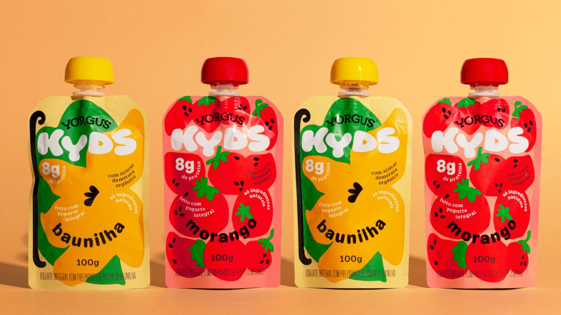
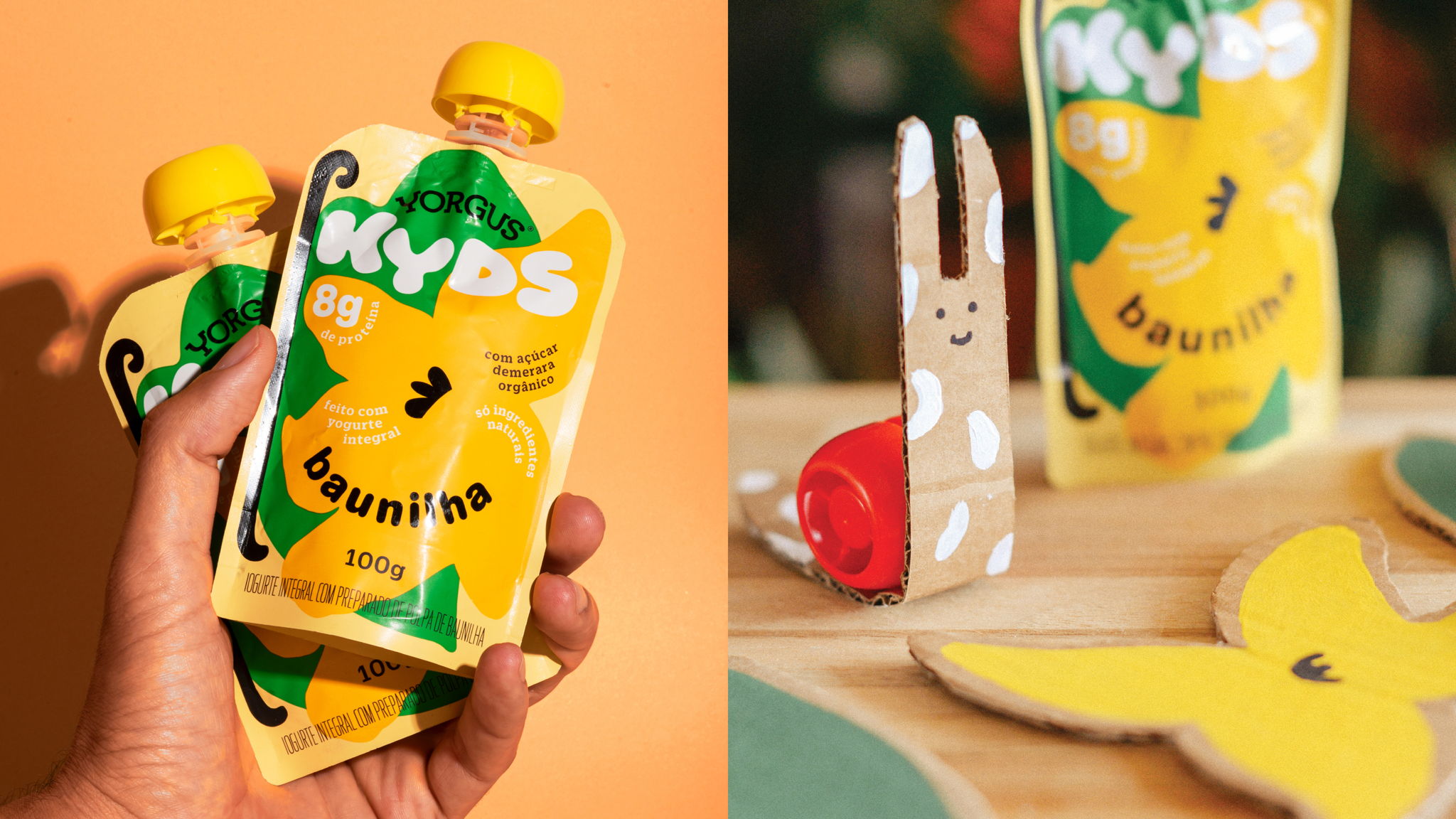
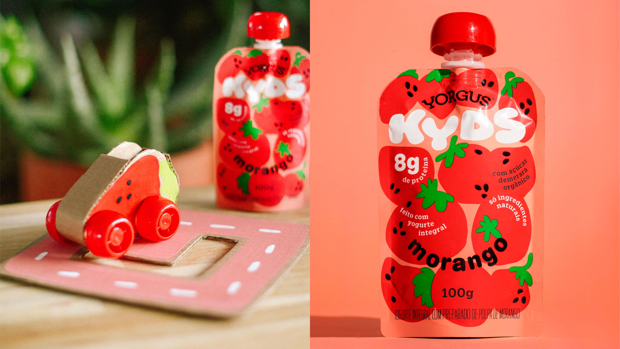
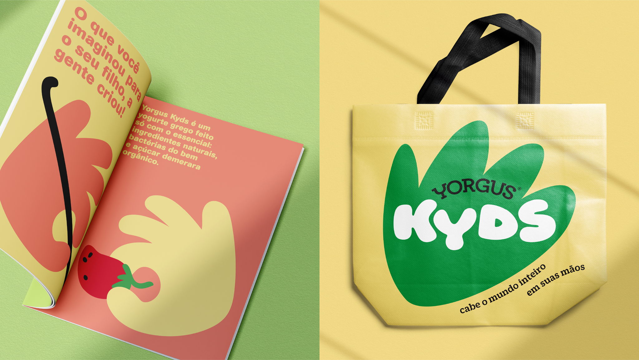
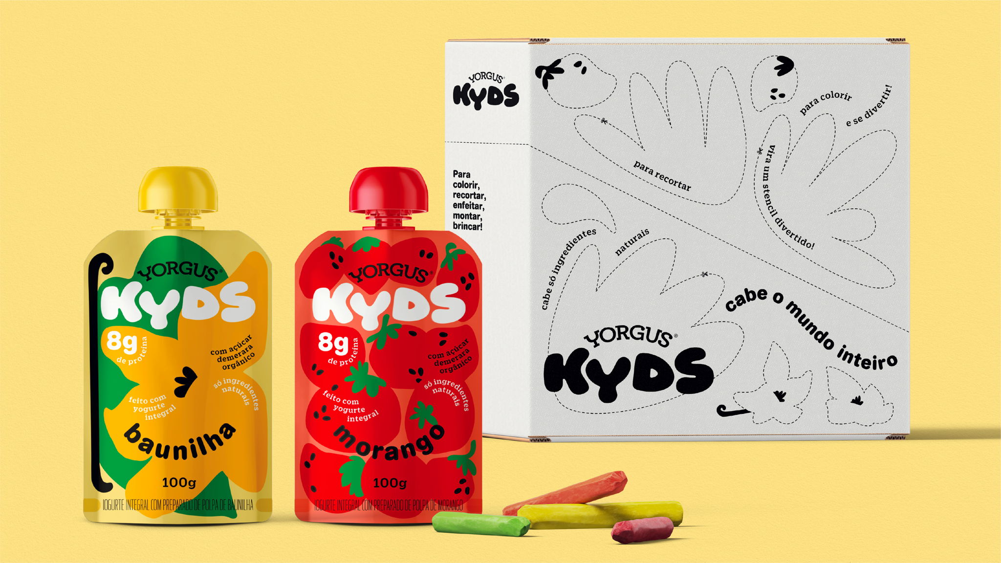
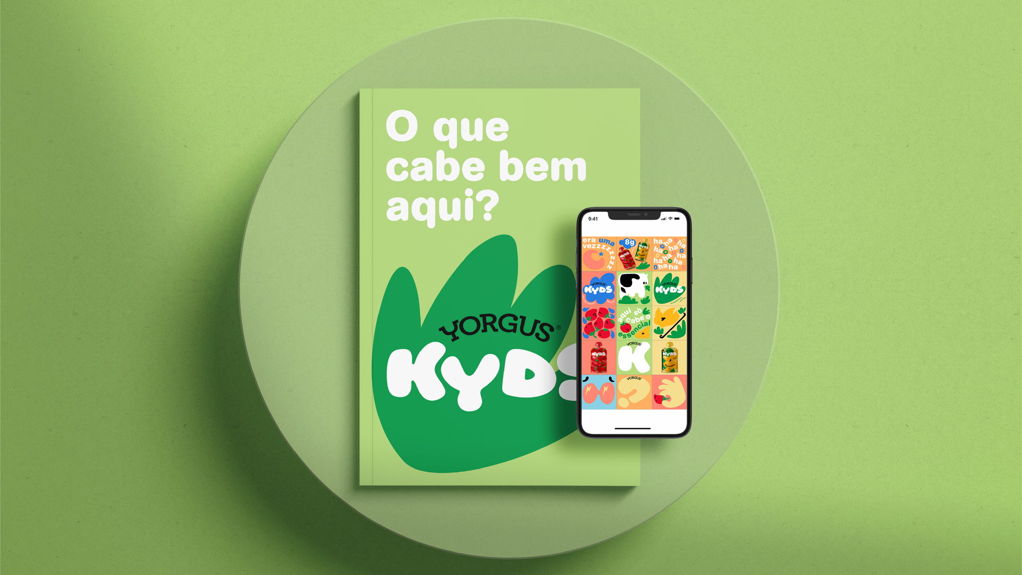
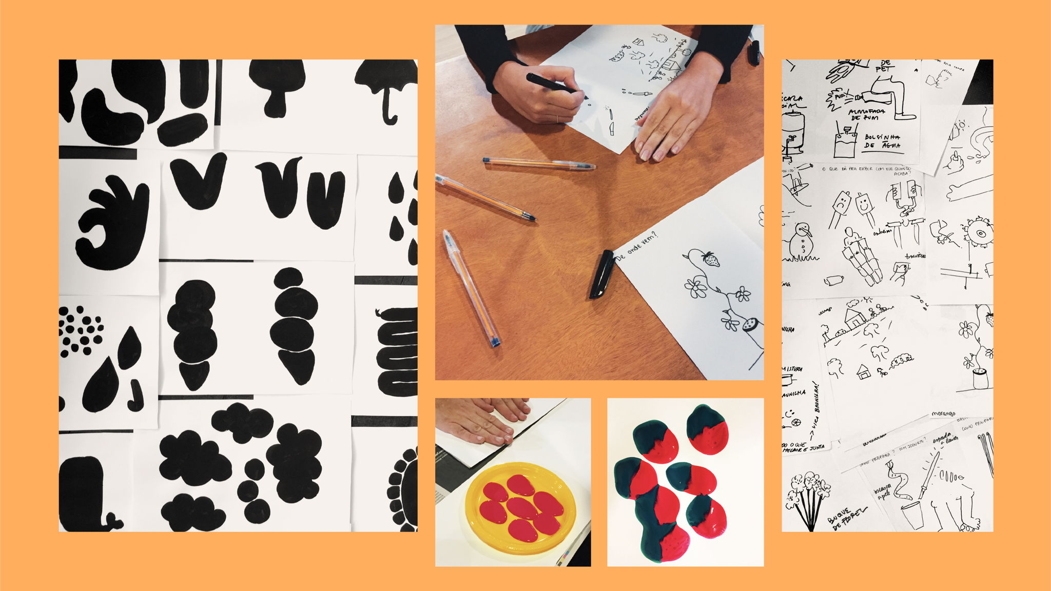
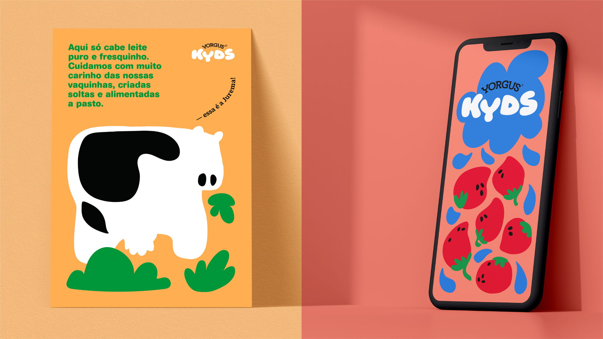
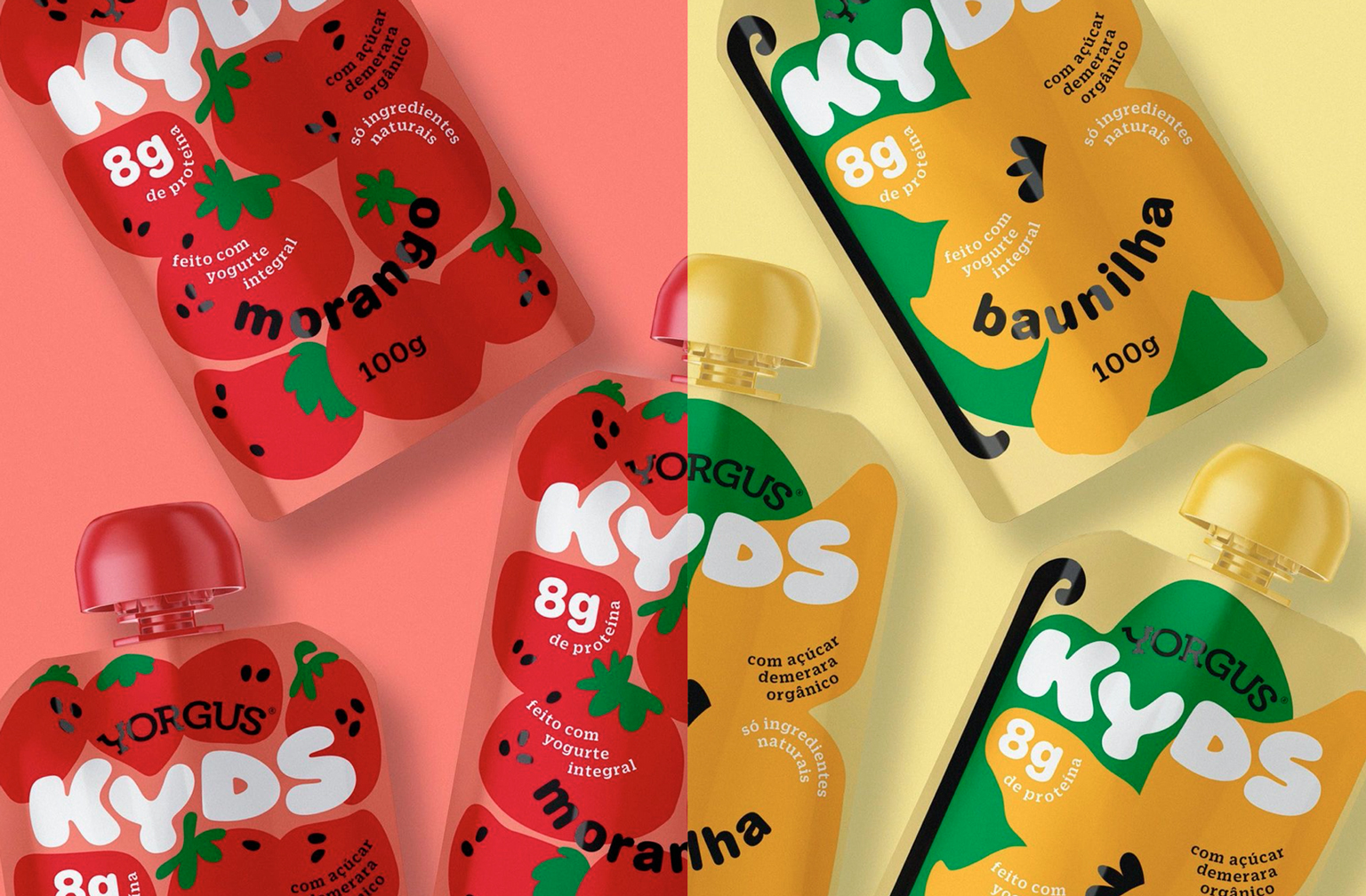
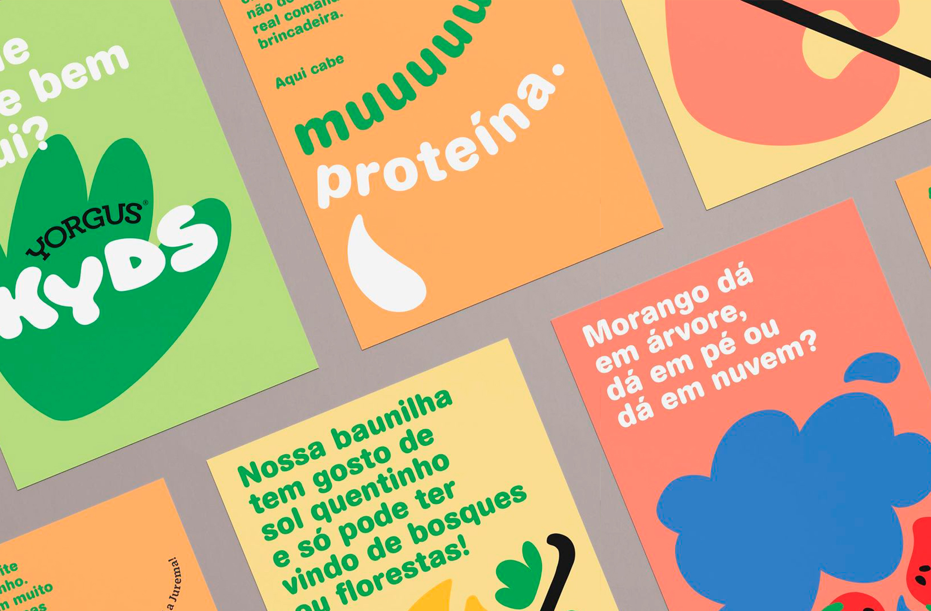
Naming, visual identity and packaging for @yorgusgrego's new children's yogurt. Starting from a collective experience, we raised possibilities of sensory and formal associations with Yorgus Kyds' ingredients: strawberry and vanilla. Then we got our hands dirty. The kids' universe is huge, with imagination even more so. We've played with space and shape, transforming the yogurt's sensorial form into a new identity.⠀
In the Launch Campaign for @yorgusgrego's new kids' yogurt, we showcased a world of imagination inspired by everything that fits tightly inside their packaging. Project made at Hardcuore.
Direção Geral: @brenopineschi @rafaelcazes⠀
Direção Criativa: @patriciaclarkson⠀
Equipe: @garciarenata @blvckcvssvndrv⠀
@gabriela_cb @jobimvictor @andrewnishida @fefows @talitabarcelos⠀
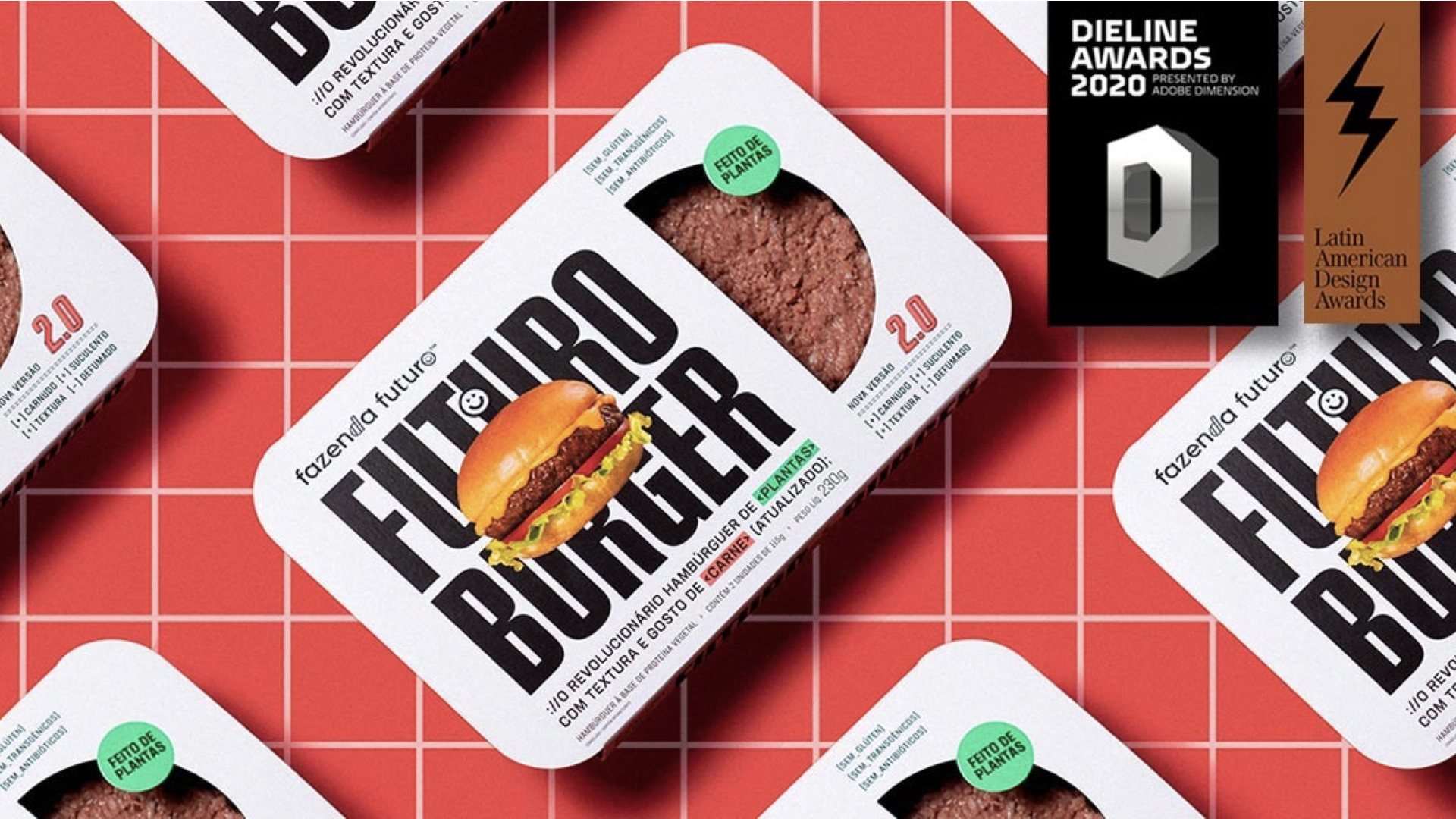


Second Place at DIELINE Awards 2020
and Third Place at LAD Awards 2019
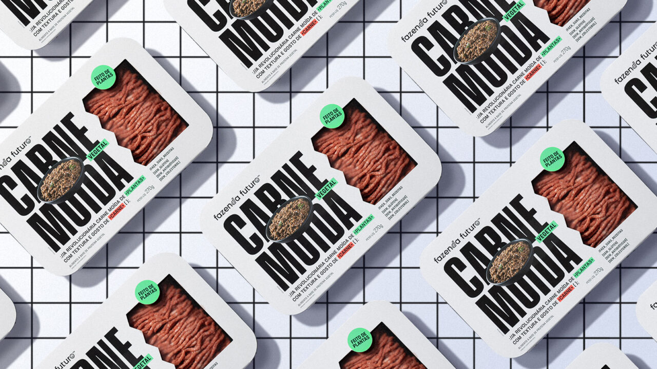
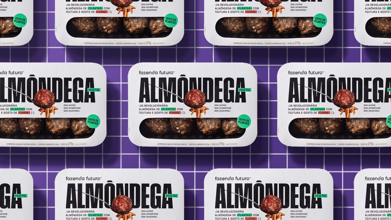
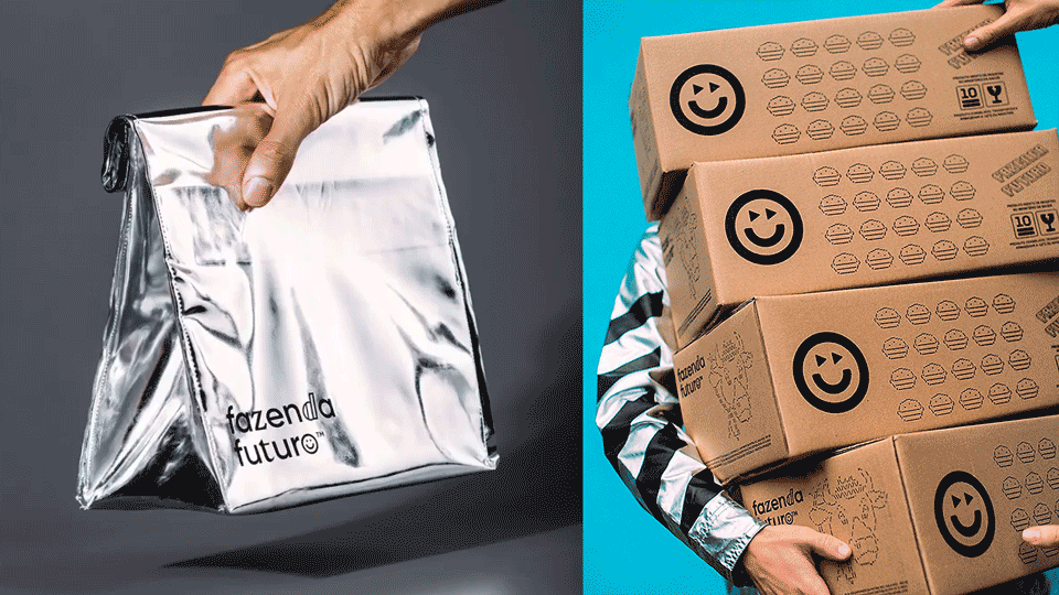
Branding project for the plant-based brand, from strategy to the entire visual identity, language, packaging design and communication. We used various elements of the universe of programming, software and cryptography to provoke the public and challenge the status quo without losing irreverence. A complete project to create a brand that is winning the world, accelerating the shift towards more sustainable food.
Hardcuore are awarded in Branding category at LAD Design Award 2019 and awarded in DIELINE AWARDS 2020, the “Oscars” of global packaging design, for @fazendafuturo’s project. Project made at Hardcuore.
Estratégia, naming, campanha e design de embalagem @hard_cuore.
Direção Geral: @brenopineschi @rafacazes ⠀
Equipe: @garciarenata @fefows @teobaldx⠀
@jobimvictor @juliabaguiar @aapotemkin @andrewnishida @talitabarcelos @gabriela_cb
and Third Place at LAD Awards 2019
Branding project for the plant-based brand, from strategy to the entire visual identity, language, packaging design and communication. We used various elements of the universe of programming, software and cryptography to provoke the public and challenge the status quo without losing irreverence. A complete project to create a brand that is winning the world, accelerating the shift towards more sustainable food.
Hardcuore are awarded in Branding category at LAD Design Award 2019 and awarded in DIELINE AWARDS 2020, the “Oscars” of global packaging design, for @fazendafuturo’s project. Project made at Hardcuore.
Estratégia, naming, campanha e design de embalagem @hard_cuore.
Direção Geral: @brenopineschi @rafacazes ⠀
Equipe: @garciarenata @fefows @teobaldx⠀
@jobimvictor @juliabaguiar @aapotemkin @andrewnishida @talitabarcelos @gabriela_cb
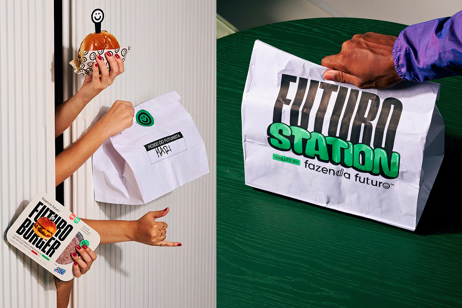

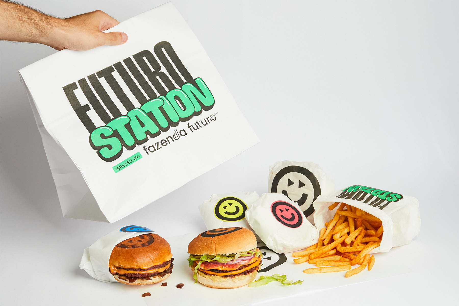

Futuro Station is the new space base of Future Farm. Great tip for tasty snack and plant-based food fans, the burger place works in dark kitchen style, in orbit (or delivery), so you can eat anywhere.
With 100% vegan recipes, the project uses technology to change consumption habits of humanity.
Made by @hard_cuore.
Direção Geral: @brenopineschi @rafacazes ⠀
Equipe: @garciarenata @fefows @teobaldx⠀
@jobimvictor @juliabaguiar @lucas_noel
With 100% vegan recipes, the project uses technology to change consumption habits of humanity.
Made by @hard_cuore.
Direção Geral: @brenopineschi @rafacazes ⠀
Equipe: @garciarenata @fefows @teobaldx⠀
@jobimvictor @juliabaguiar @lucas_noel


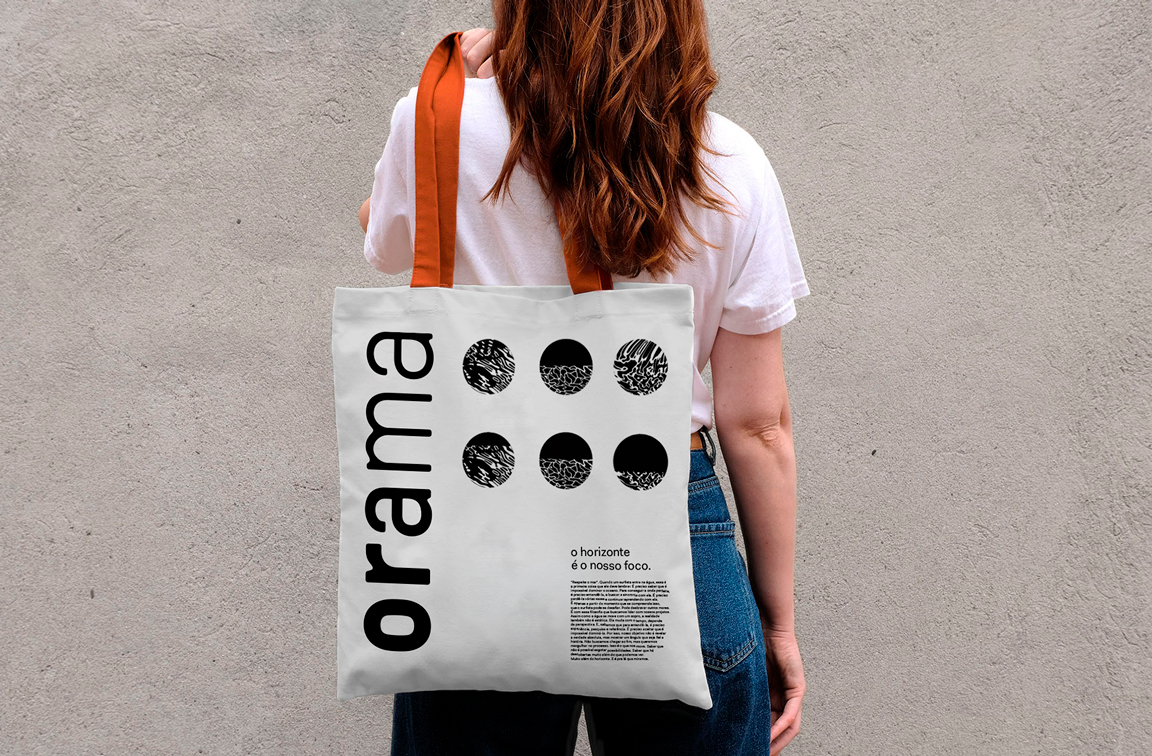

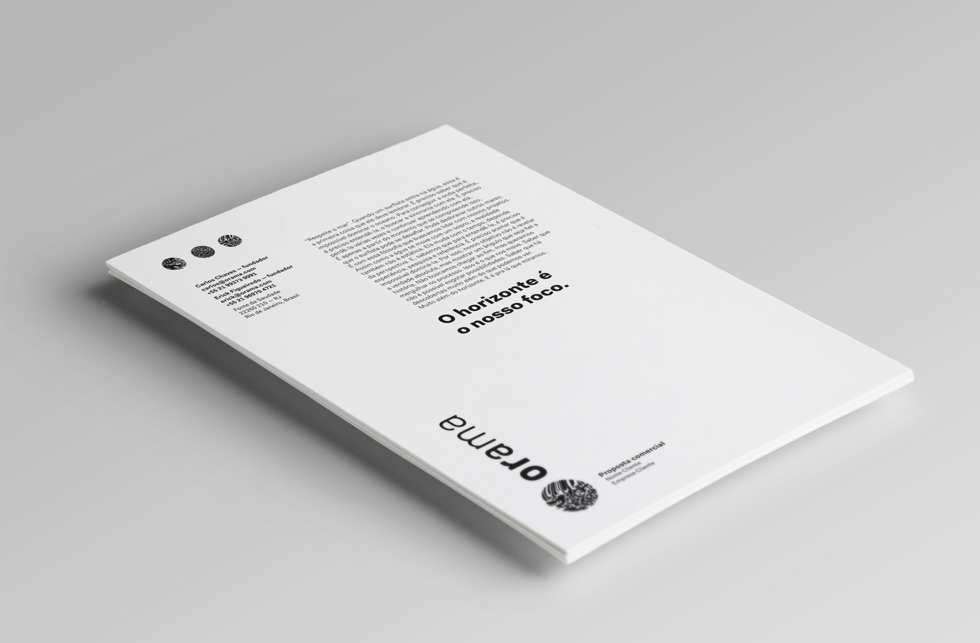


Mar e câmera. Luz e sombra. Todo conteúdo audiovisual deve, além de entreter, gerar reflexão. Dessa forma, a Orama passou a prestar atenção em tudo que falava, tudo que produzia, para mostrar um lado que ainda não havia sido retratado.
Visual Identity: Victor Jobim
Strategy: Louise Alves
Social midia design: Christian Proença
Além do sol e do mar serem os conceitos para gerar o lettering, que compõem a assinatura visual, suas fases e transformações serviram para a criação de toda a linguagem da Orama. As fases do mar estão representadas através dos grafismos, que podem estar em sua forma livre – em laranja – ou contidas dentro das formas geométricas.
Visual Identity: Victor Jobim
Strategy: Louise Alves
Social midia design: Christian Proença