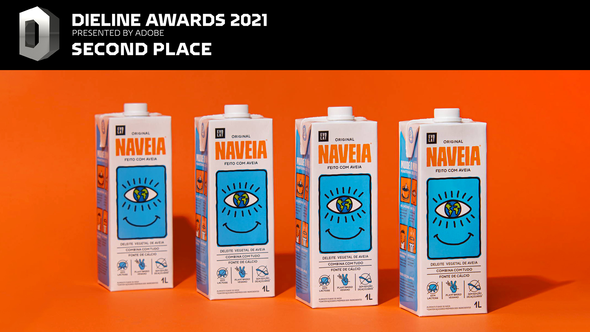

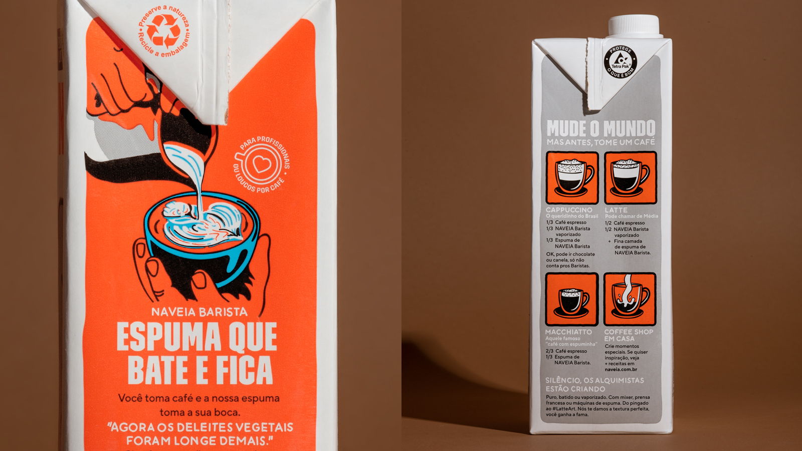
Second place in DIELINE Awards 2021
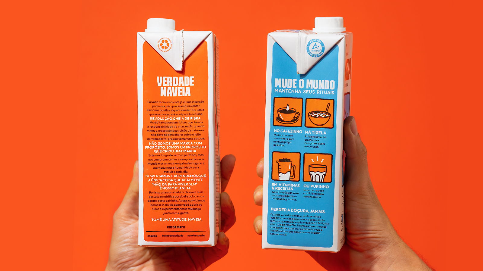
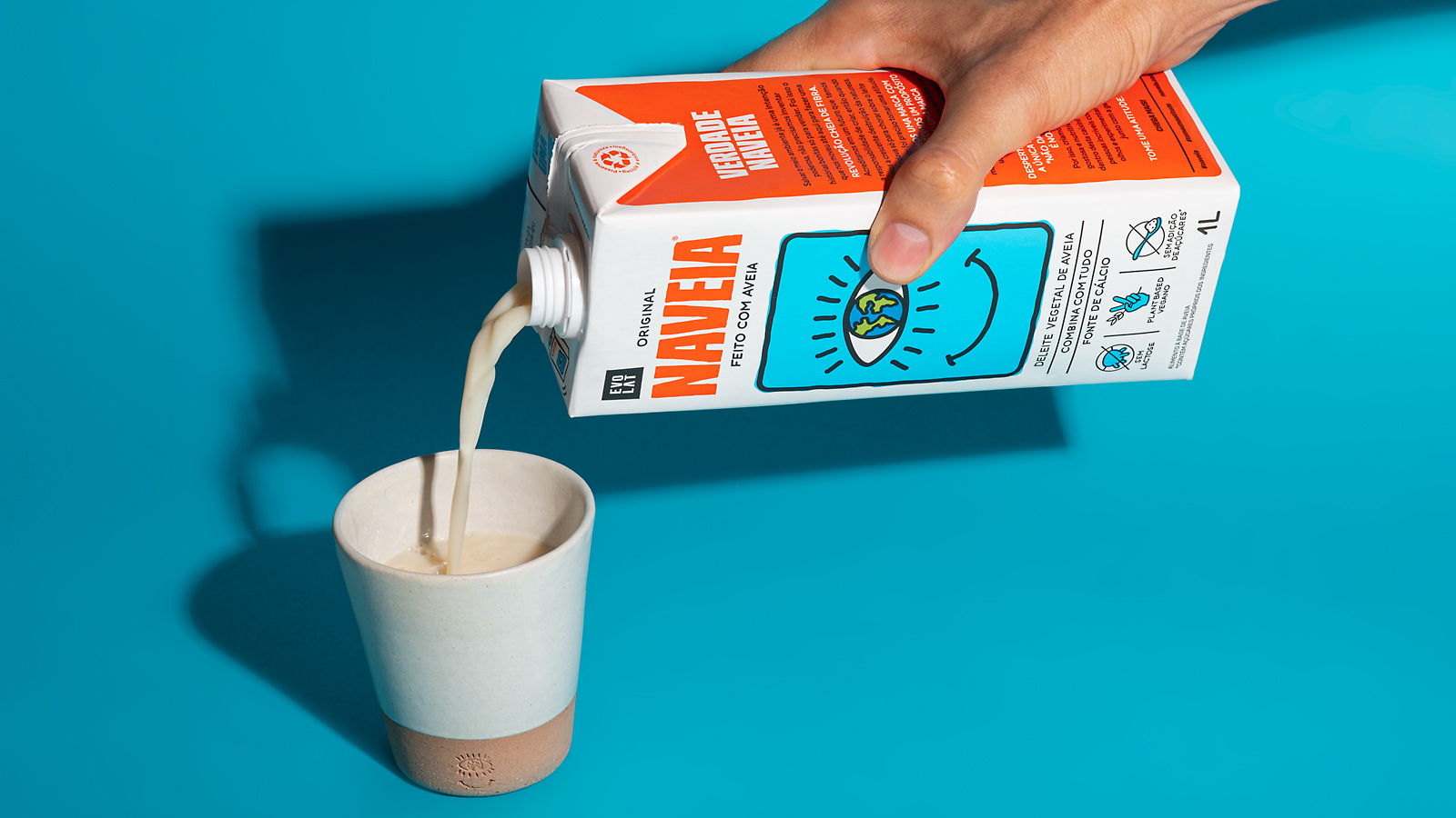
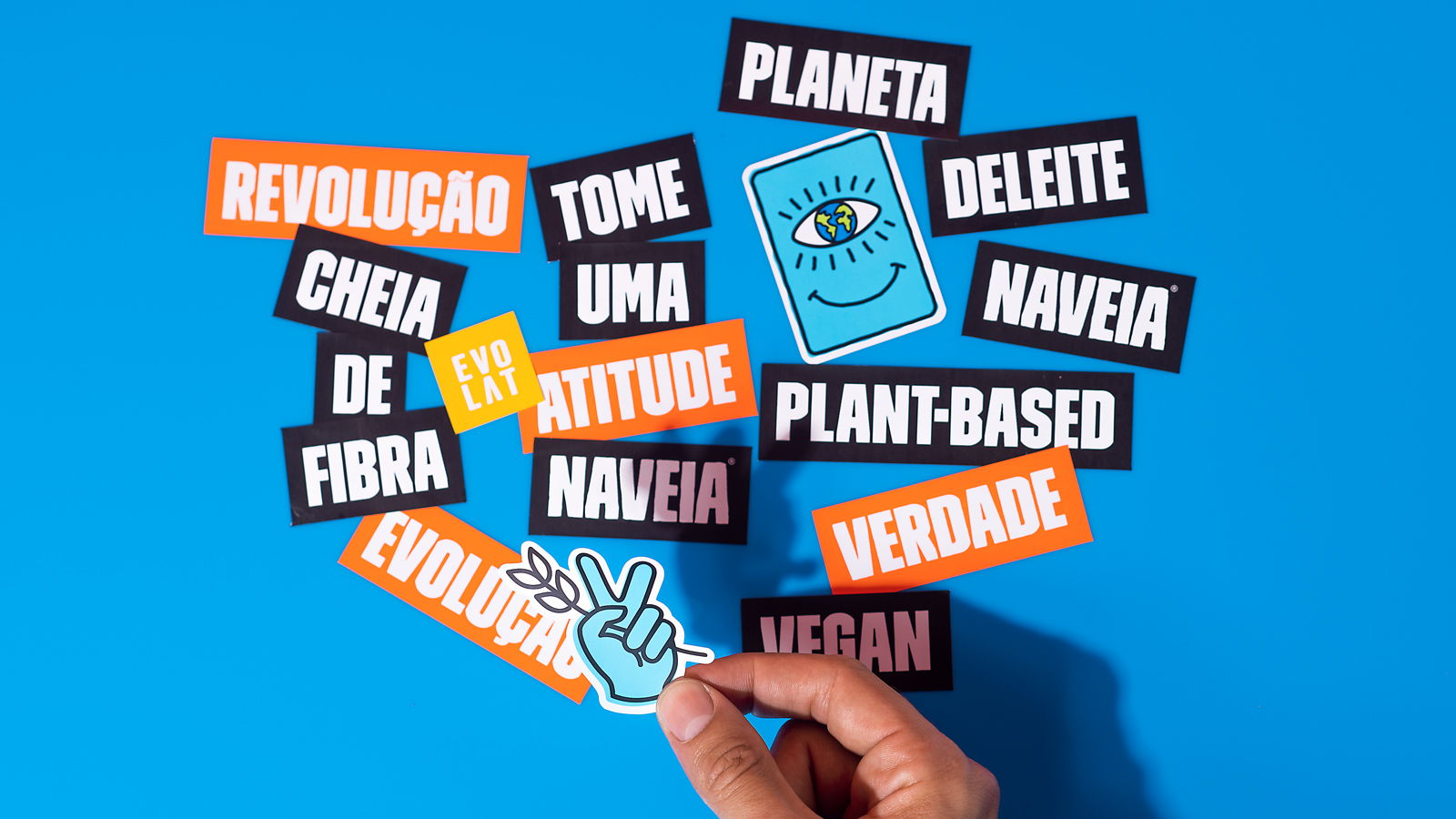
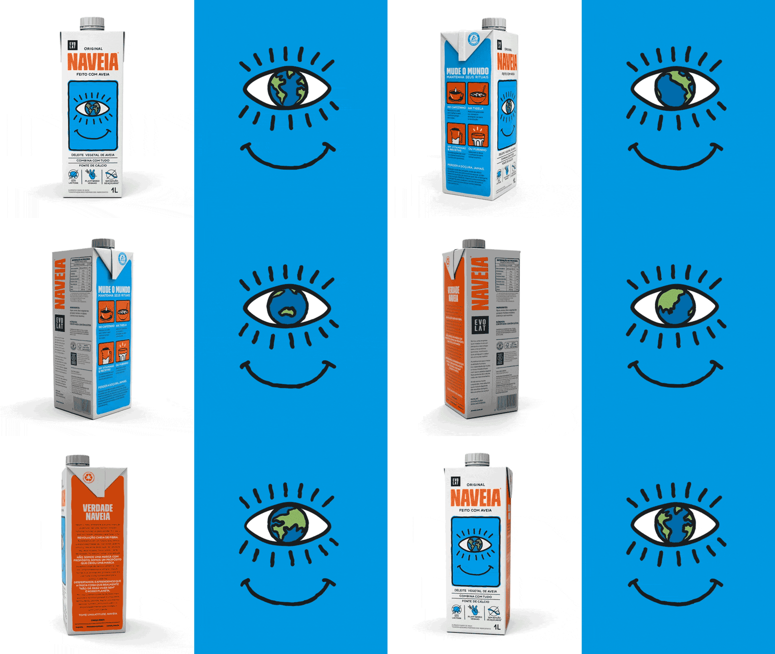
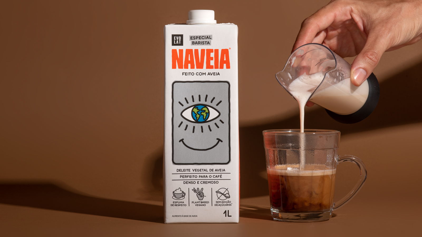
Branding, communication, brand architecture, iconography and packaging design for @naveia. Activism and sustainability are part of the fiber-rich revolution proposed by the brand. We hightlighted the strong positioning of the vegan drink, whose mission is to make people rethink their eating habits. With vegetable milk, Naveia choose the path without guilt, putting the planet and animals first. Take action, experience this change!
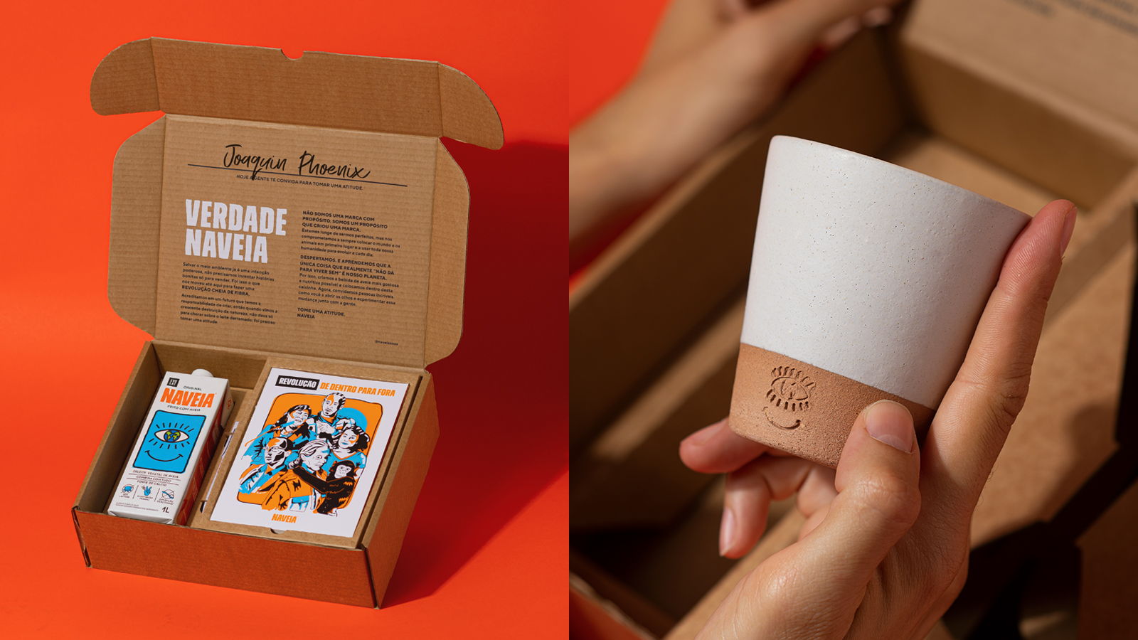
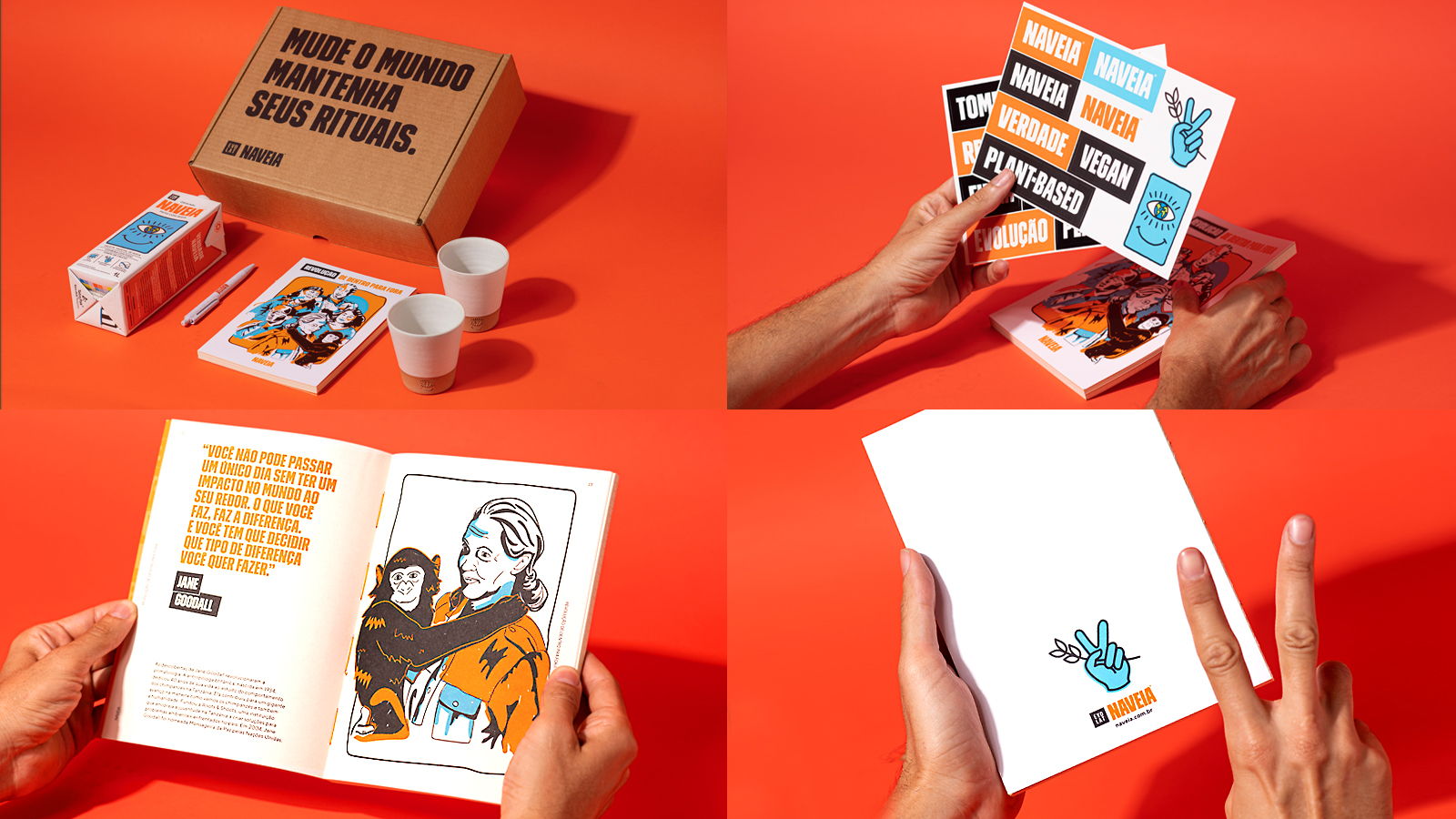
Inspired by activists who left a positive impact on the world, we created a press kit that calls on others to wake up and take action. With an illustrated book celebrating evolutionary stories and a personalized ceramic cup, each ritual with Naveia becomes an invitation to a fiber-filled revolution. Project made at Hardcuore.
Direção Geral: @brenopineschi @rafaelcazes⠀
Equipe Hardcuore: @garciarenata⠀
@fefows @teobaldx @complexica⠀
@jobimvictor @paoladiash @caroulpinheiro⠀
@gabriela_cb @talitabarcelos @brpsmachado
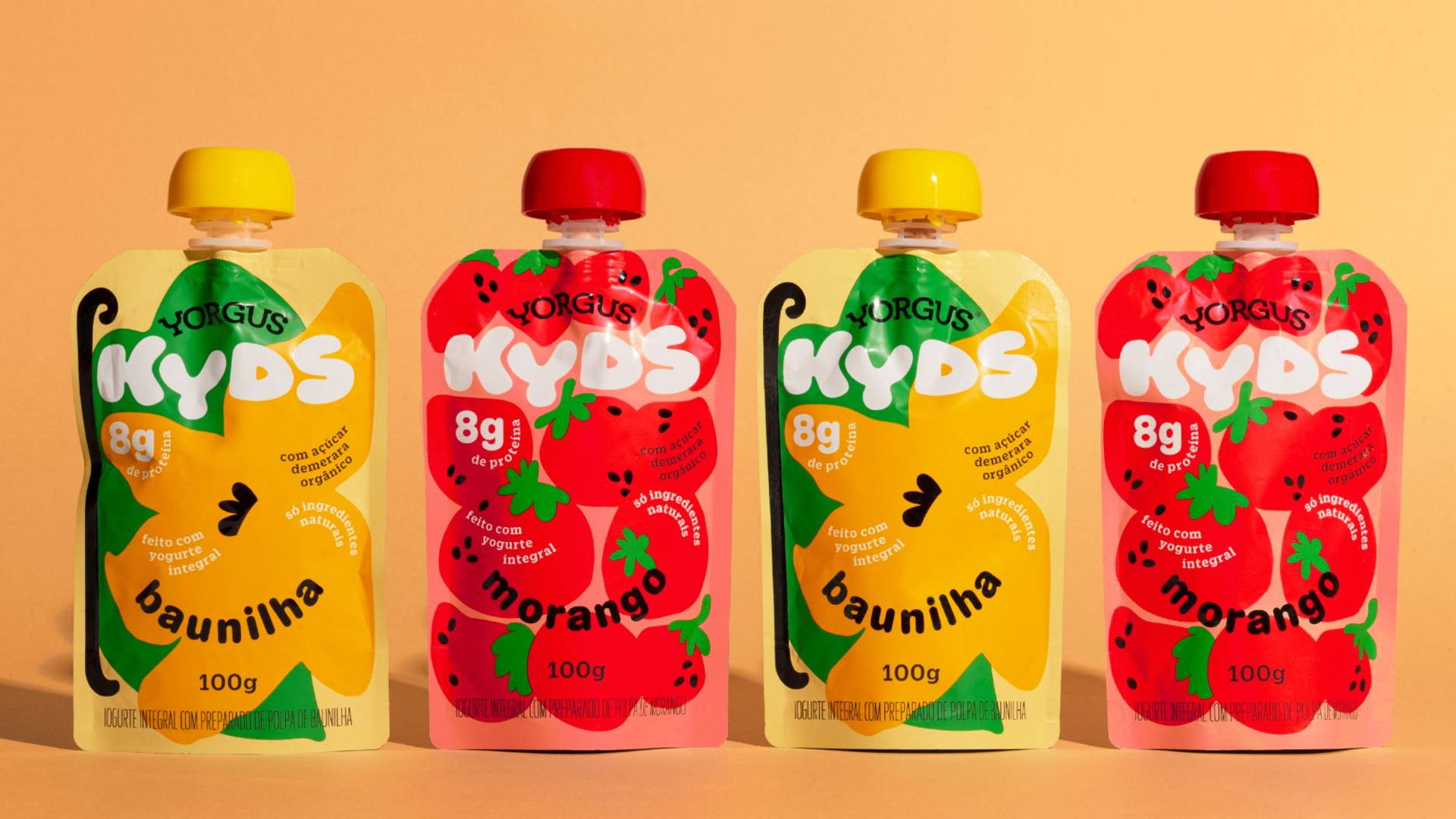
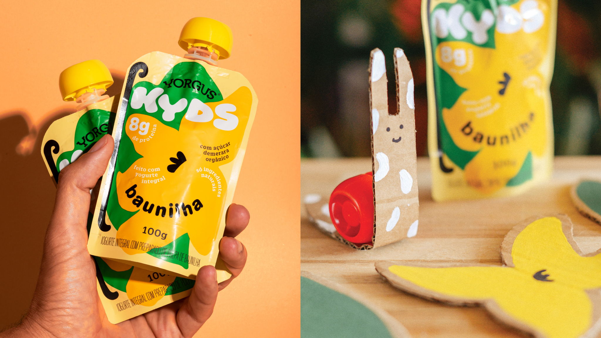
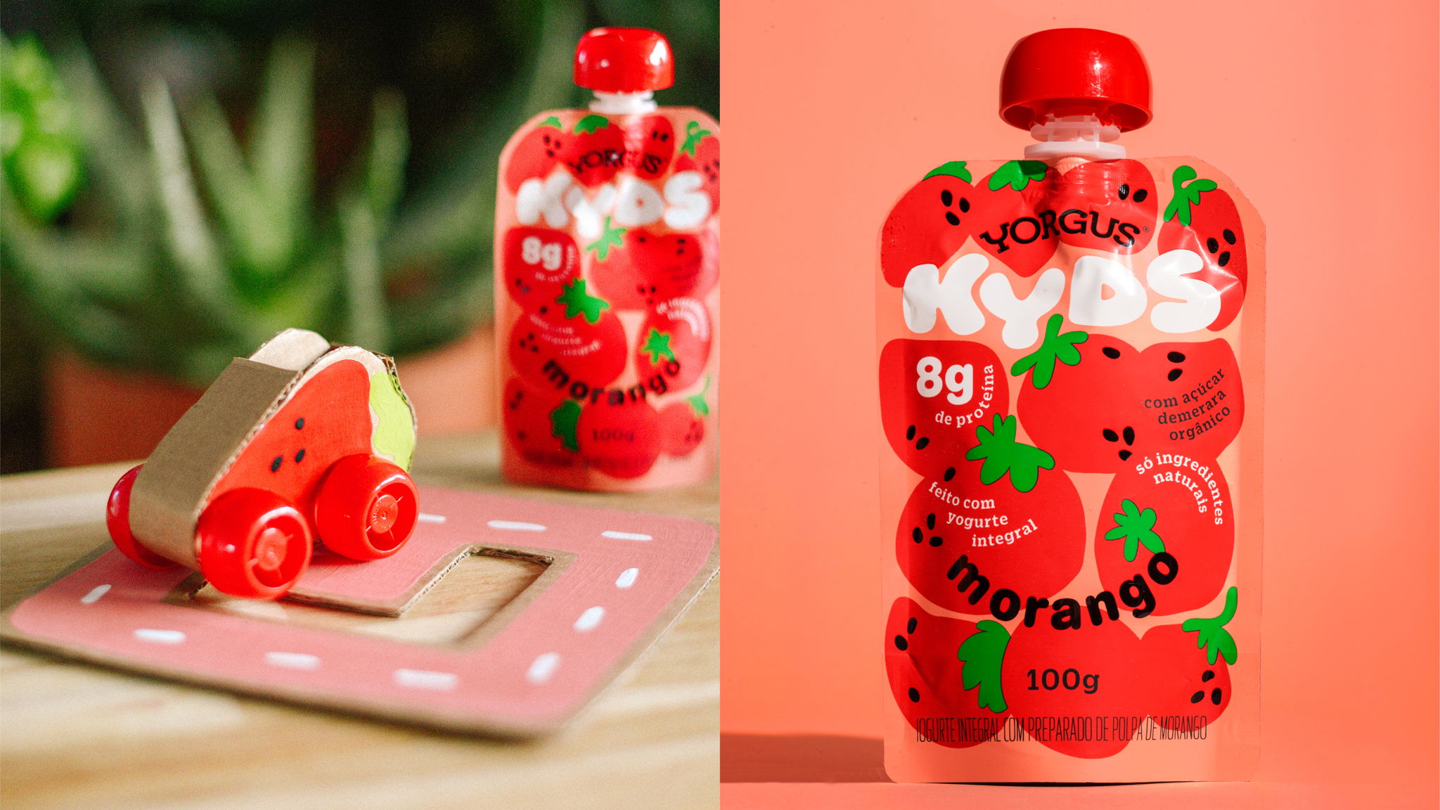


Third place in DIELINE Awards 2021.
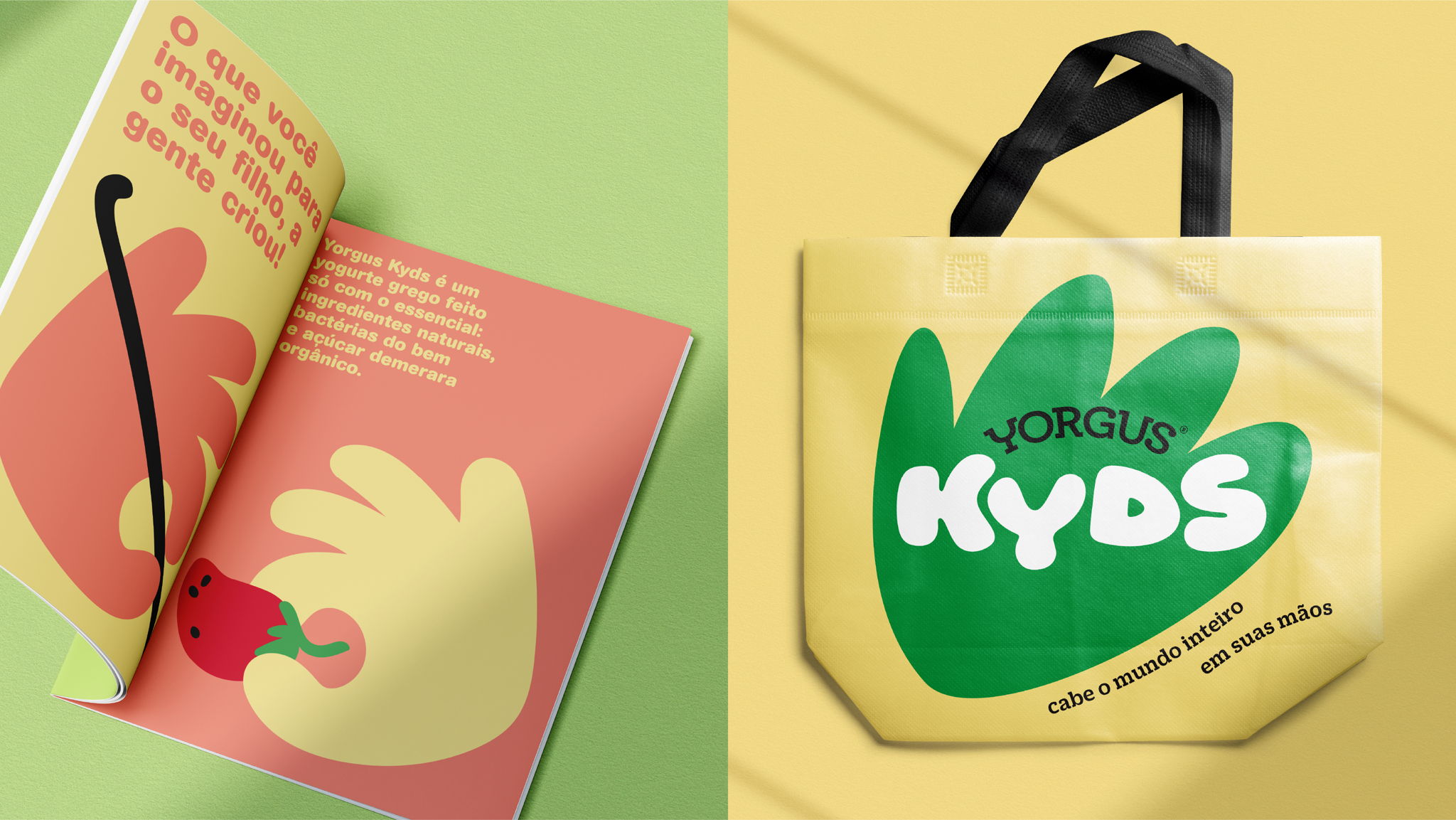
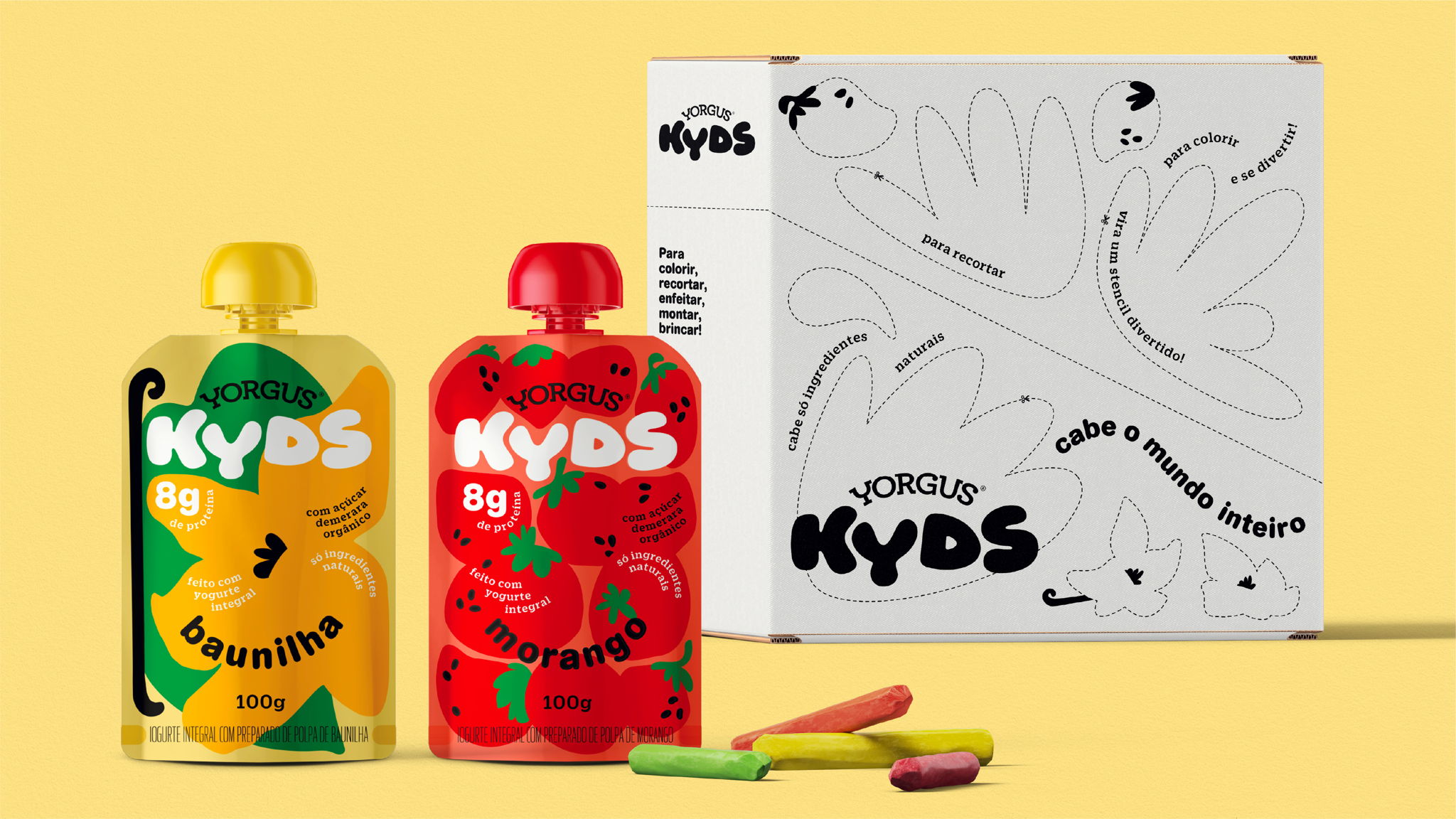
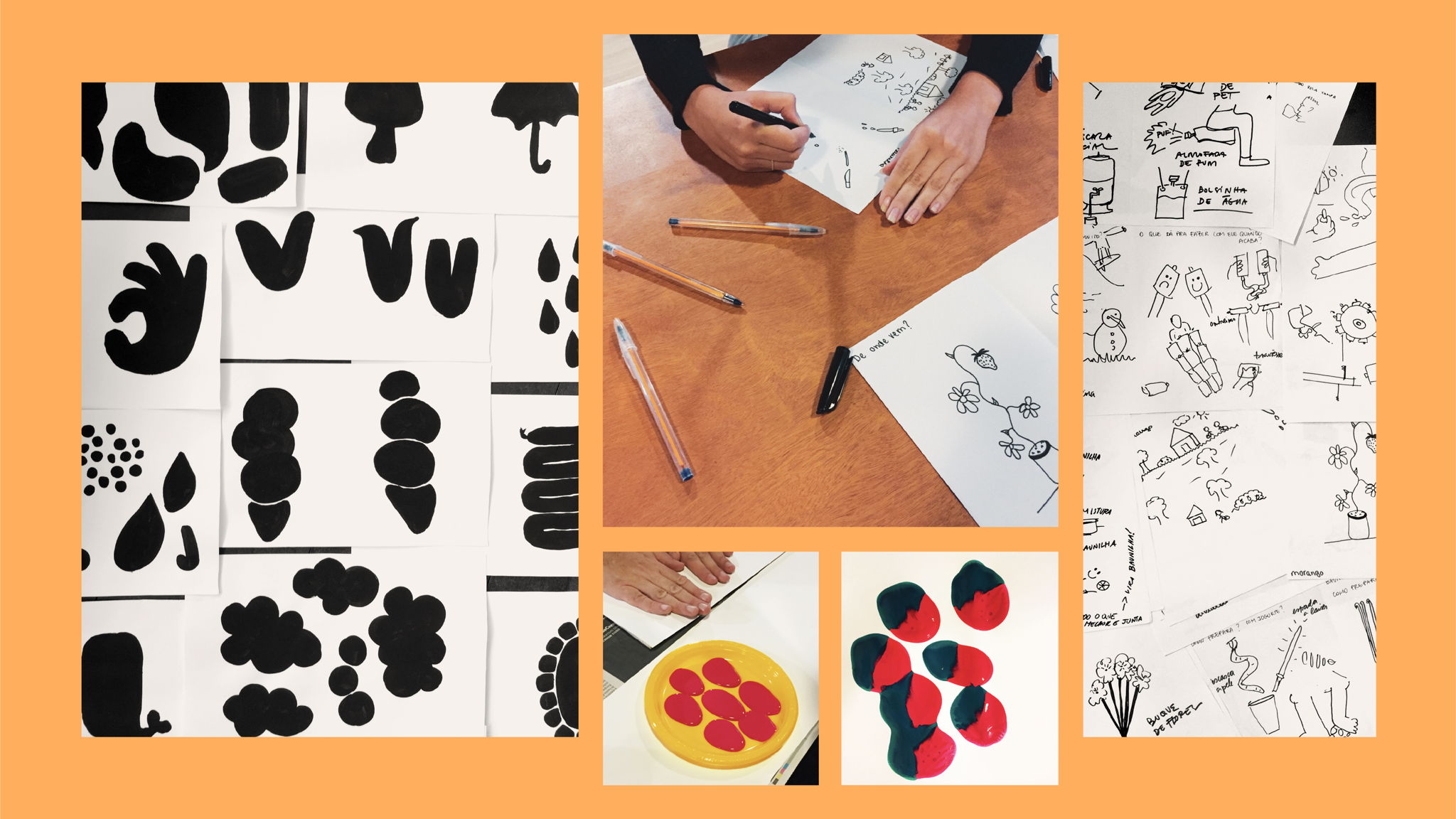
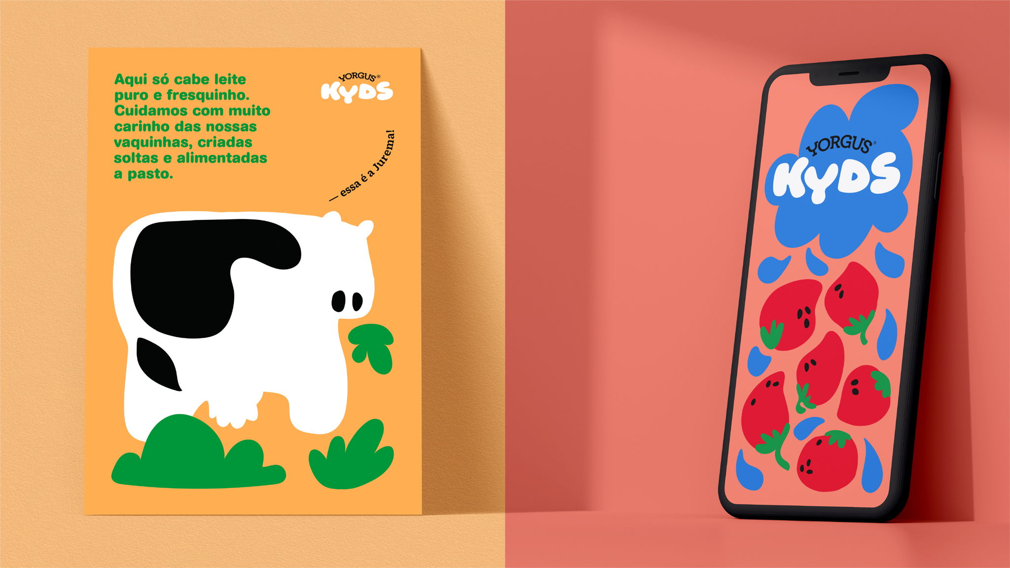
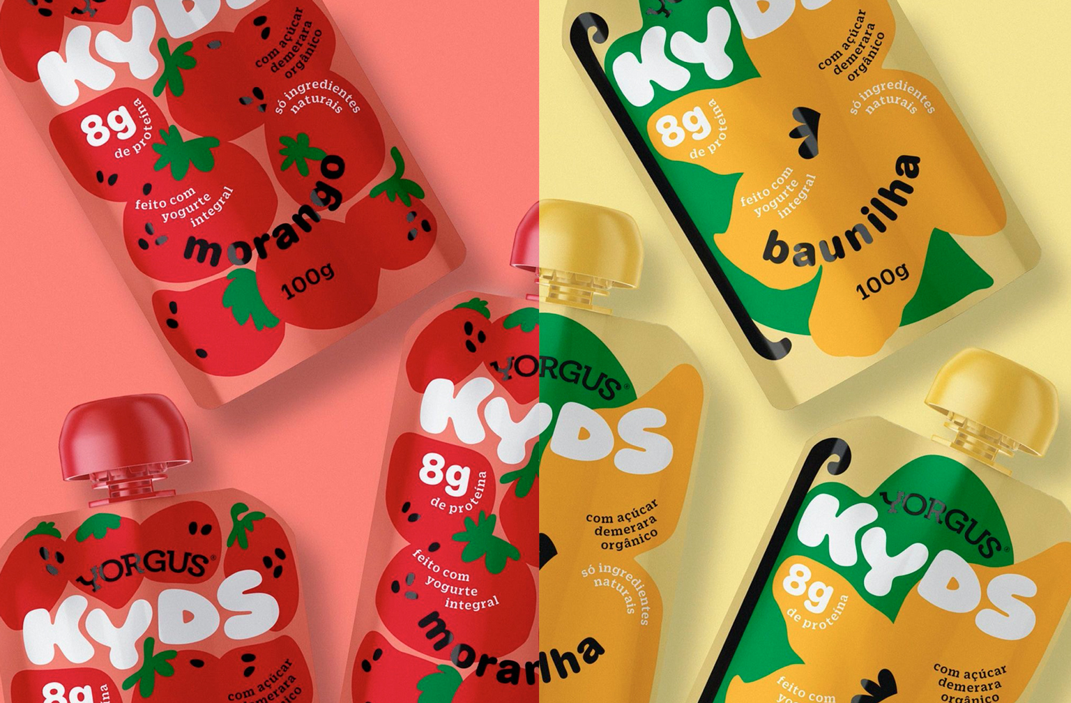
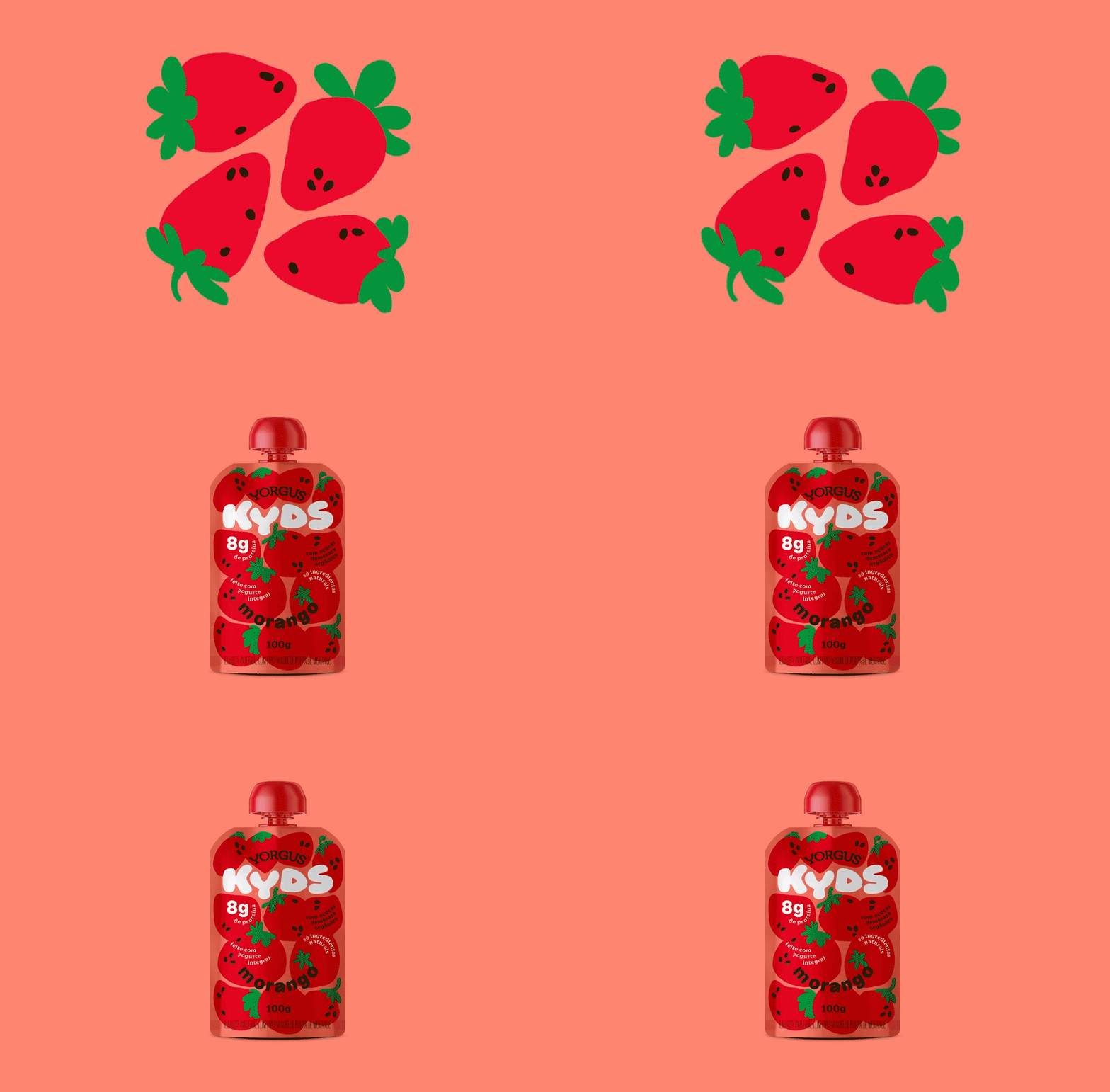
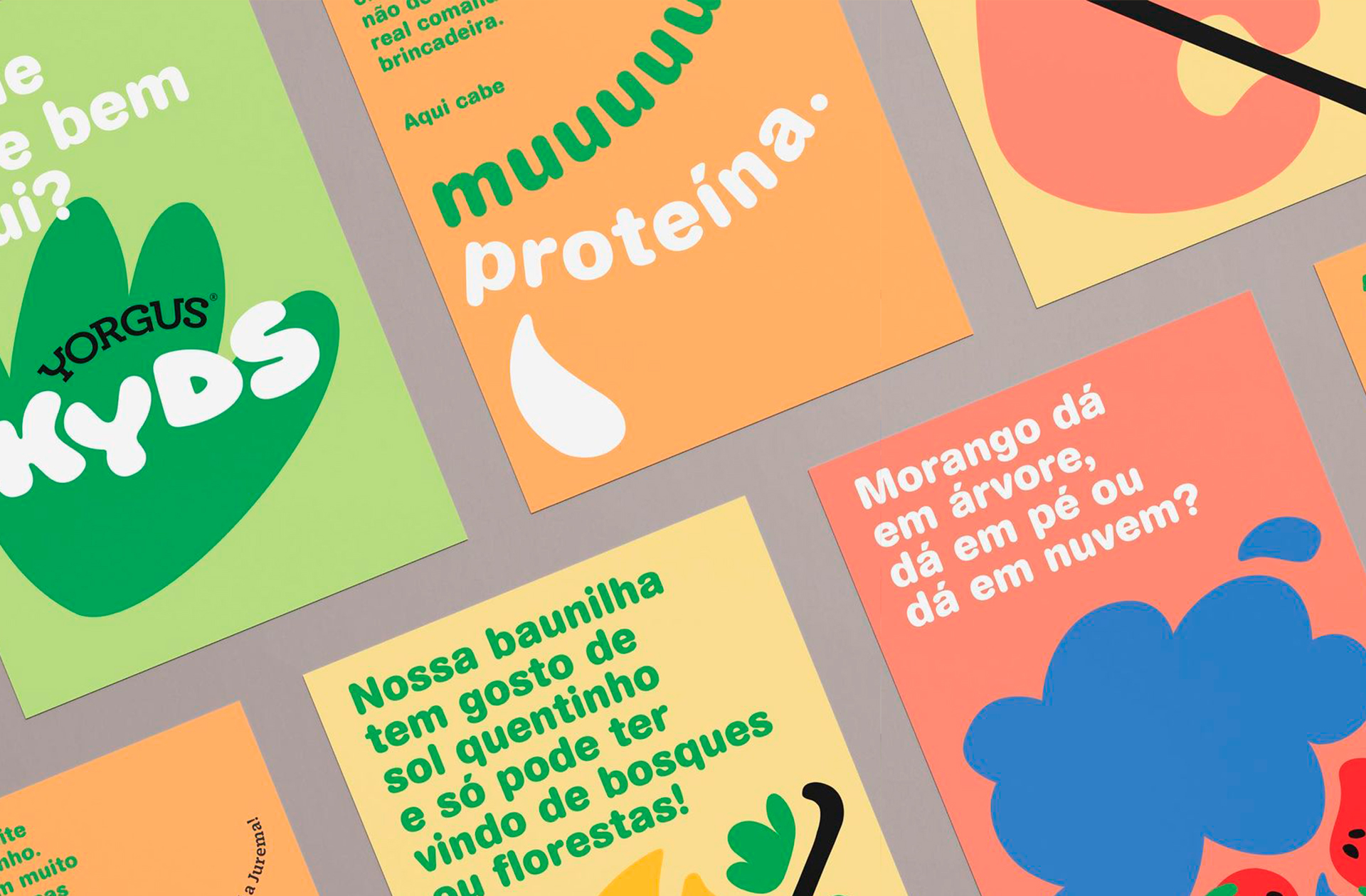
Naming, visual identity and packaging for @yorgusgrego's new children's yogurt. Starting from a collective experience, we raised possibilities of sensory and formal associations with Yorgus Kyds' ingredients: strawberry and vanilla. Then we got our hands dirty. The kids' universe is huge, with imagination even more so. We've played with space and shape, transforming the yogurt's sensorial form into a new identity.⠀
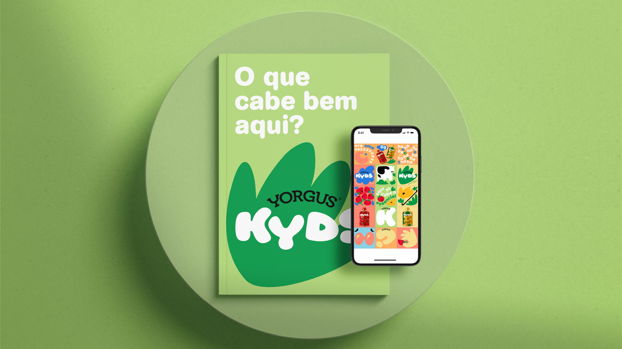
In the Launch Campaign for @yorgusgrego's new kids' yogurt, we showcased a world of imagination inspired by everything that fits tightly inside their packaging. Project made at Hardcuore.
Direção Geral: @brenopineschi @rafaelcazes⠀
Direção Criativa: @patriciaclarkson⠀
Equipe: @garciarenata @blvckcvssvndrv⠀
@gabriela_cb @jobimvictor @andrewnishida @fefows @talitabarcelos⠀
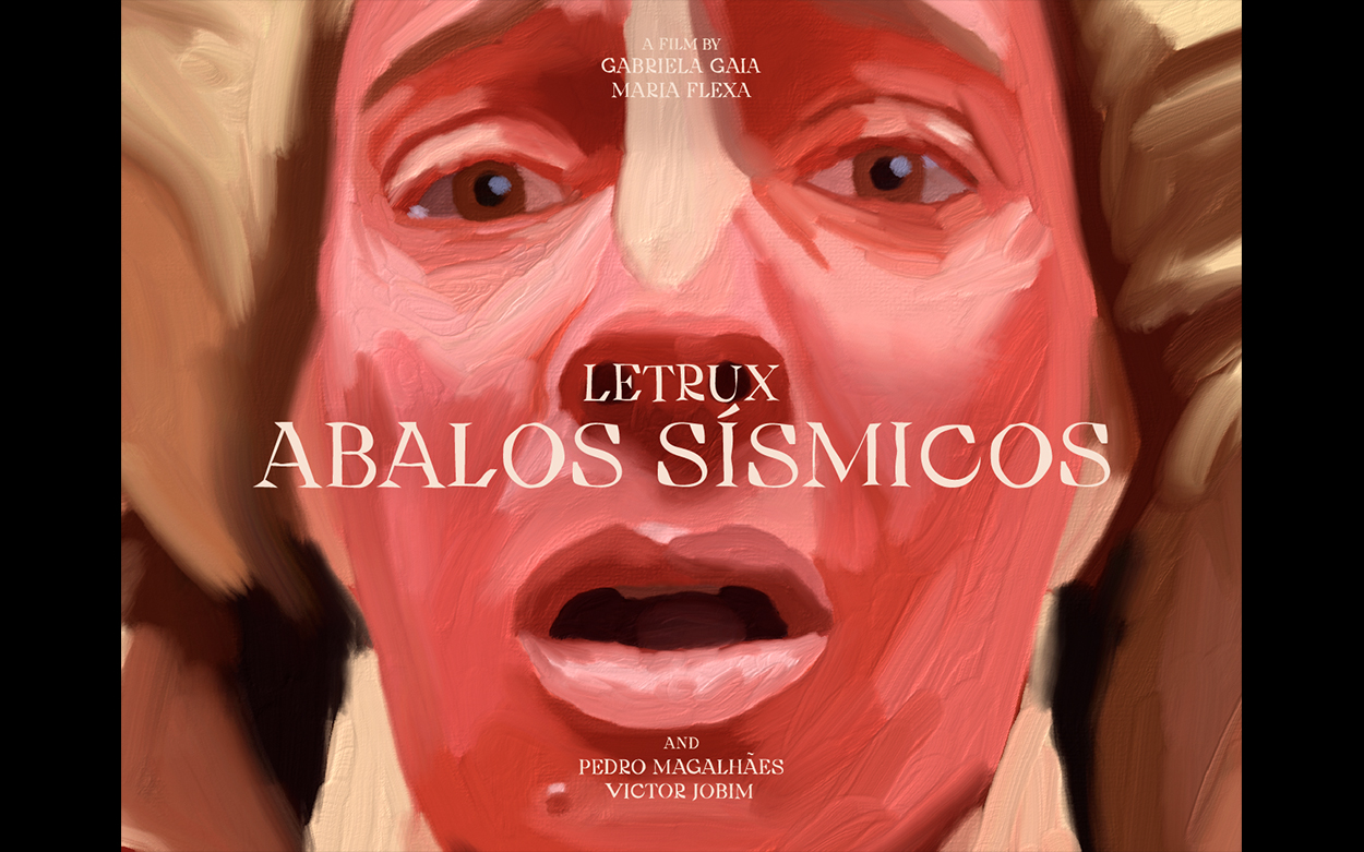


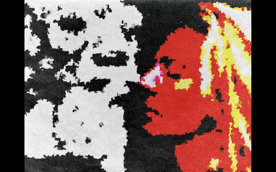


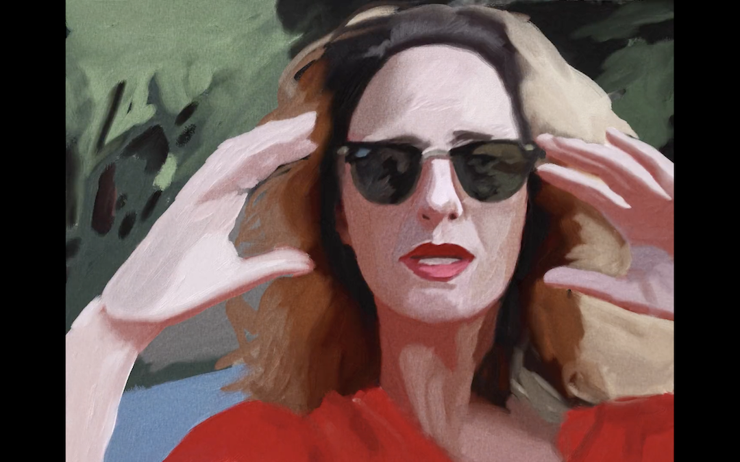
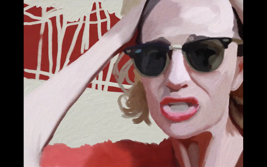


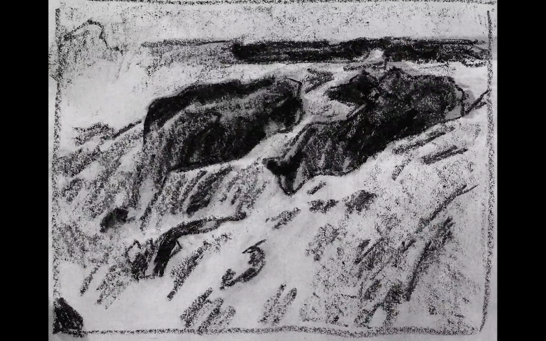

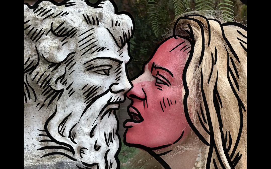

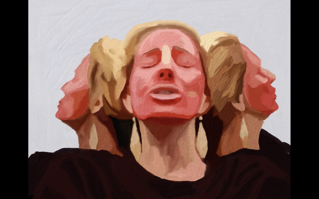
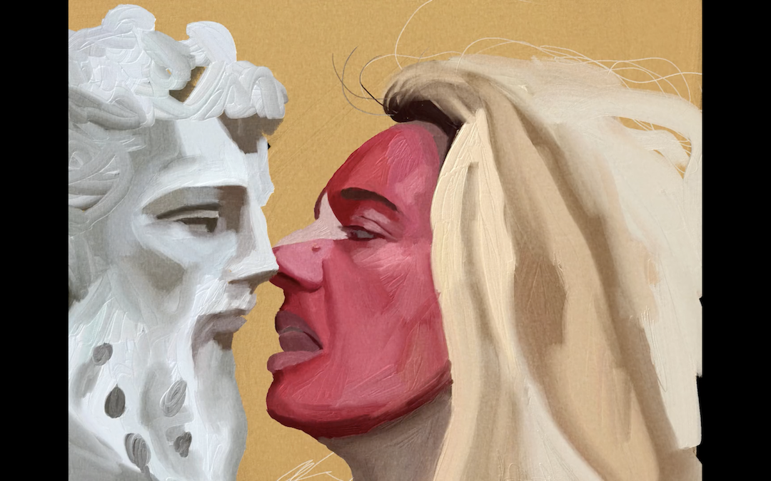




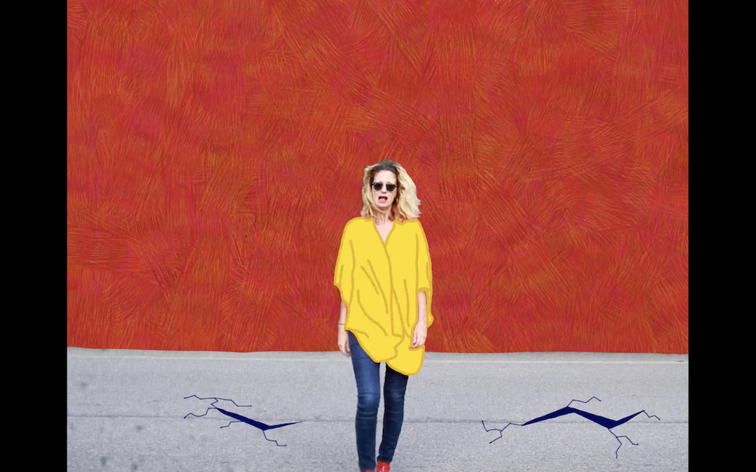

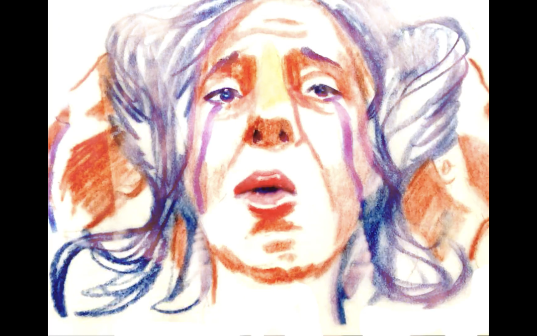


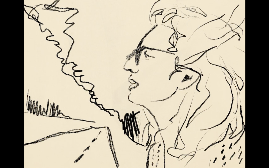

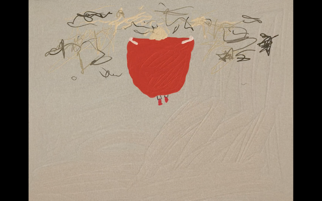

Link for music video ↗
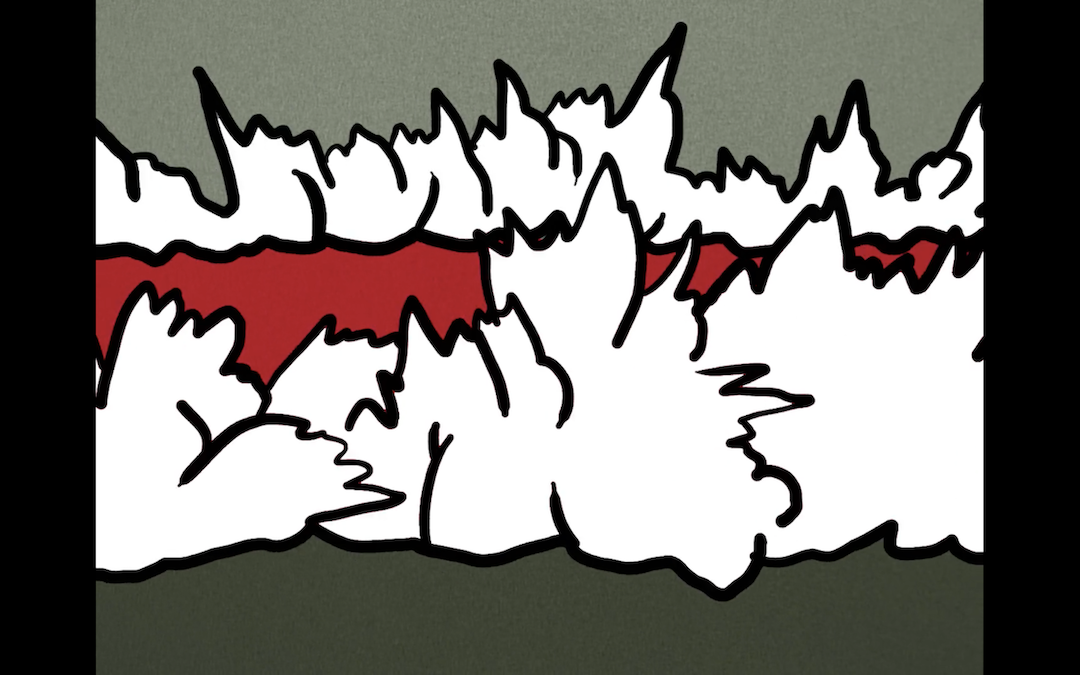
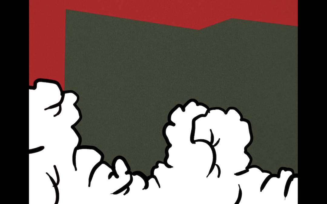
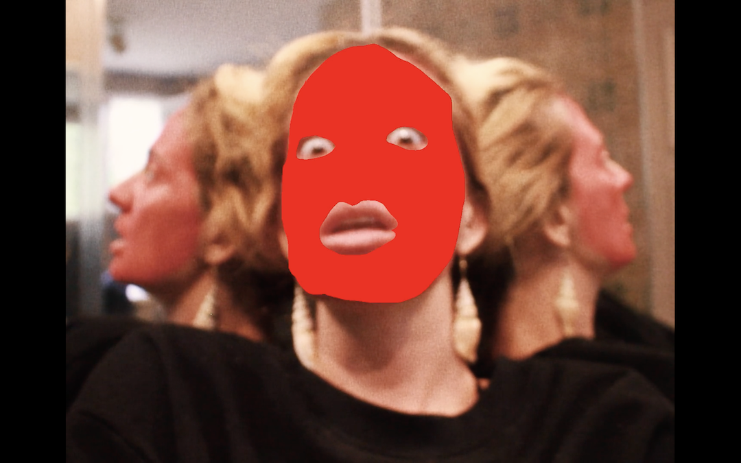
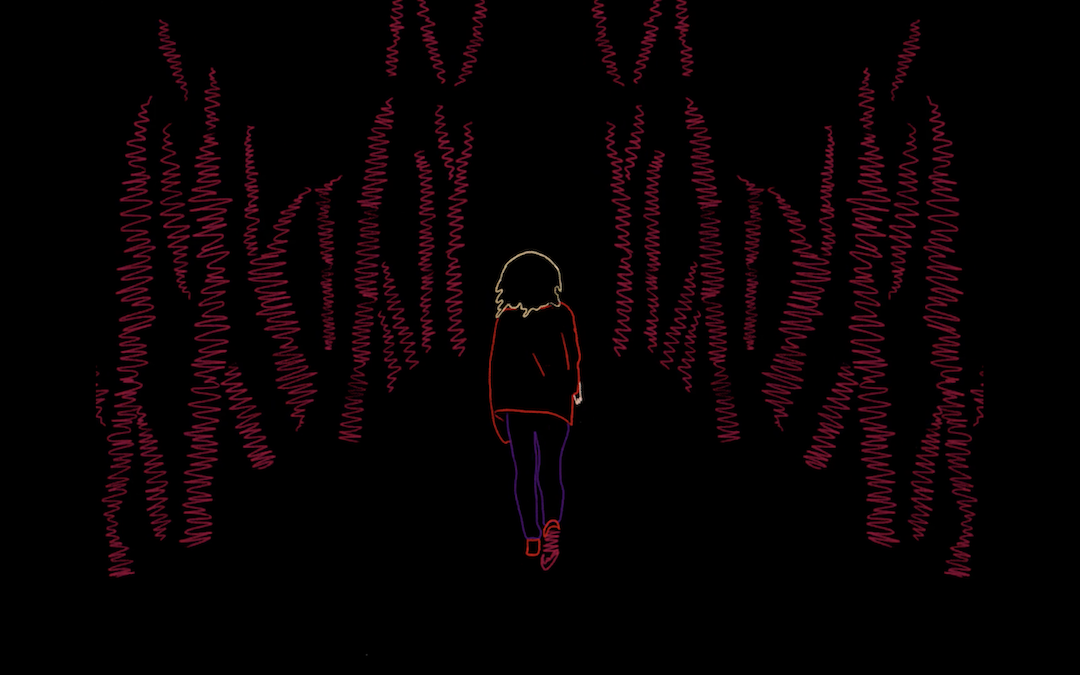
Abalos Sísmicos (“Seismic Shocks”) is an animated music video that launches Brazilian pop-indie artist “Letrux”, weeping tears, into space. Created during the first seven months of the pandemic — remote shooting the band and singer, followed by rotoscope graphic animations from 11 artists —, the visual story reflects on Brazil’s critical state of affairs through ludic paths and dreamlike logic: an essay on the daily exercise of shaping our own re-existence.
DIRECTED AND CREATED BY
Gabriela Gaia Meirelles, Maria Flexa,
Pedro Magalhãe e Victor Jobim.
ILLUSTRATED BY
Cecilia Jobim, Christian Proença,
Joana Uchôa, Larissa Jenning, Luísa Martins,
Maria Flexa, Nicole Schlegel,
Paula Werneck, Pedro Pessanha,
Renny Pereira e Victor Jobim
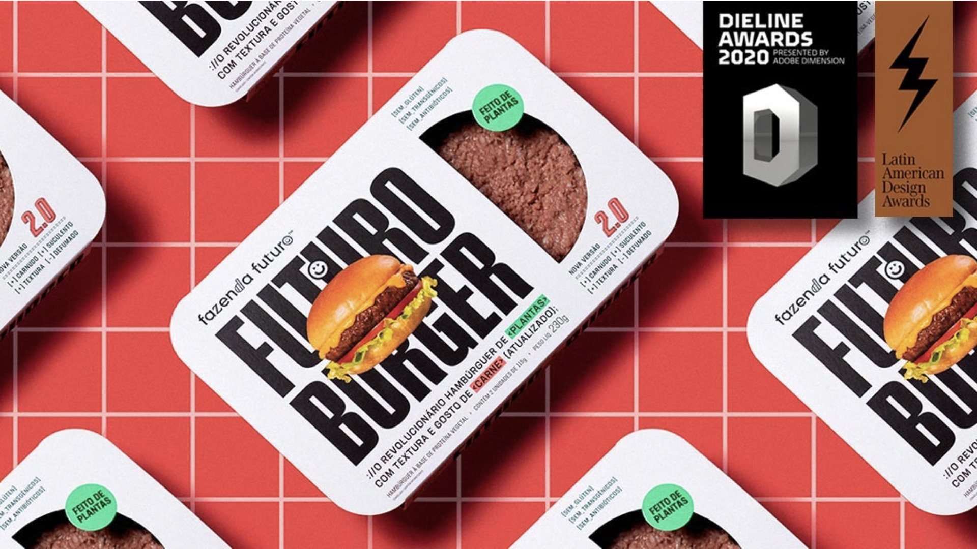
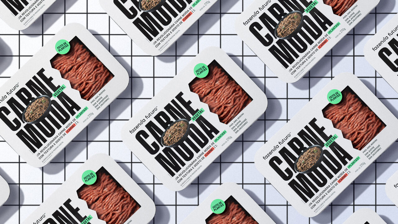
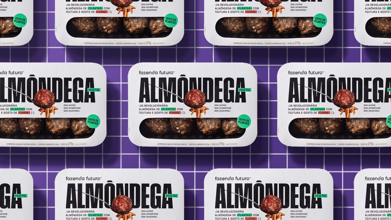



Second Place at DIELINE Awards 2020
and Third Place at LAD Awards 2019
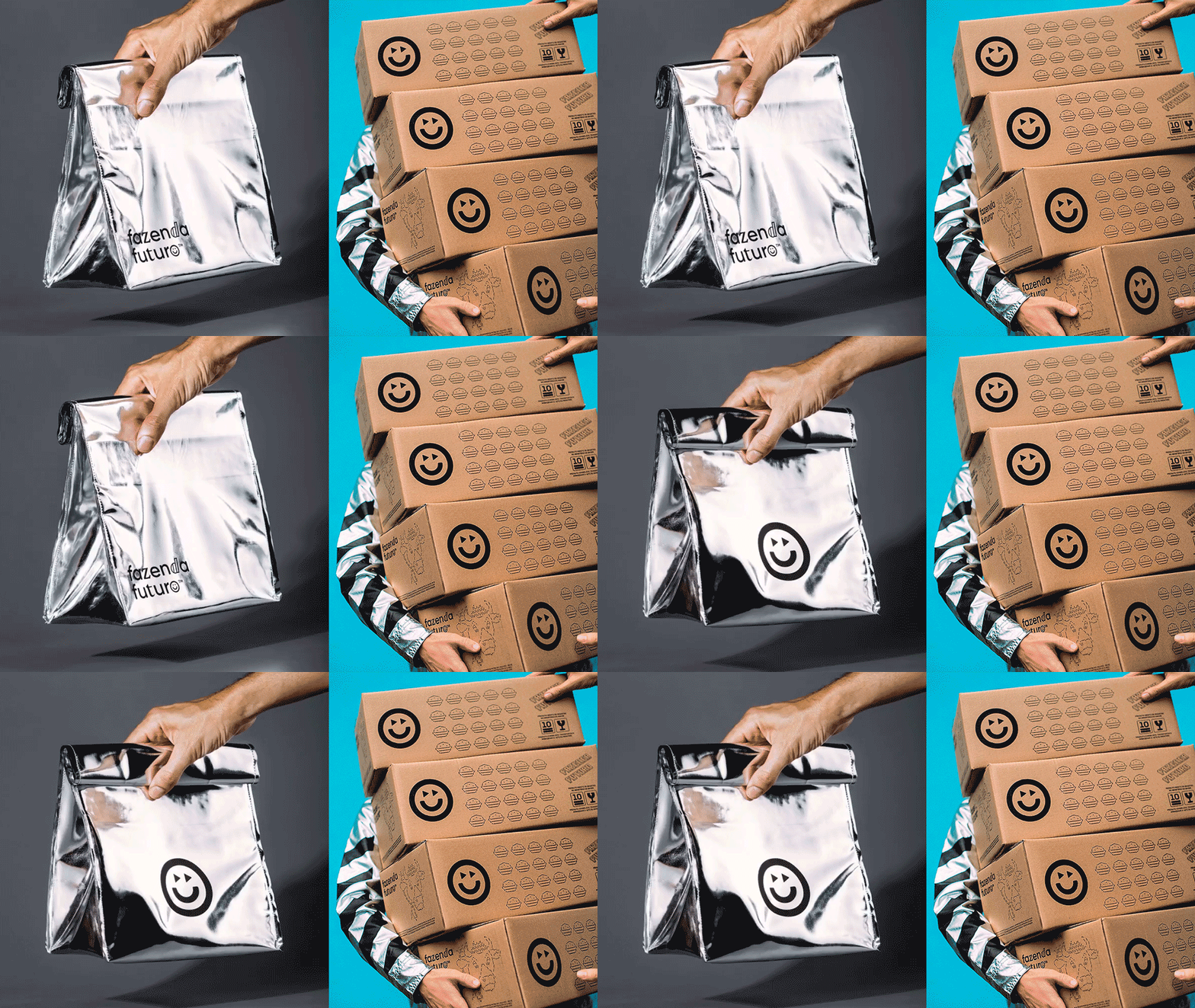
Branding project for the plant-based brand, from strategy to the entire visual identity, language, packaging design and communication. We used various elements of the universe of programming, software and cryptography to provoke the public and challenge the status quo without losing irreverence. A complete project to create a brand that is winning the world, accelerating the shift towards more sustainable food.
Hardcuore are awarded in Branding category at LAD Design Award 2019 and awarded in DIELINE AWARDS 2020, the “Oscars” of global packaging design, for @fazendafuturo’s project. Project made at Hardcuore.
Estratégia, naming, campanha e design de embalagem @hard_cuore.
Direção Geral: @brenopineschi @rafacazes ⠀
Equipe: @garciarenata @fefows @teobaldx⠀
@jobimvictor @juliabaguiar @aapotemkin @andrewnishida @talitabarcelos @gabriela_cb




Fisrt Place at
LAD Awards 2018
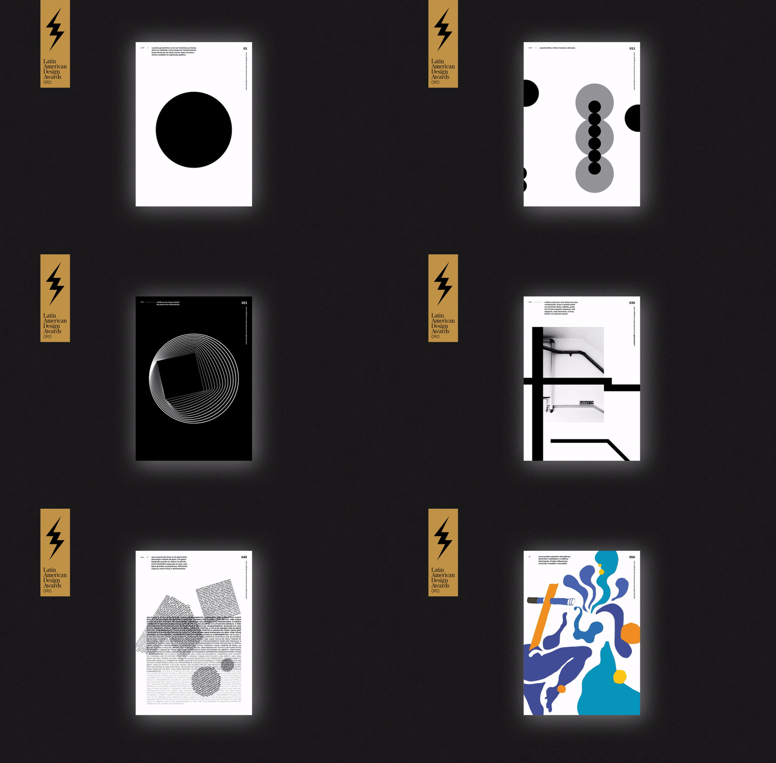
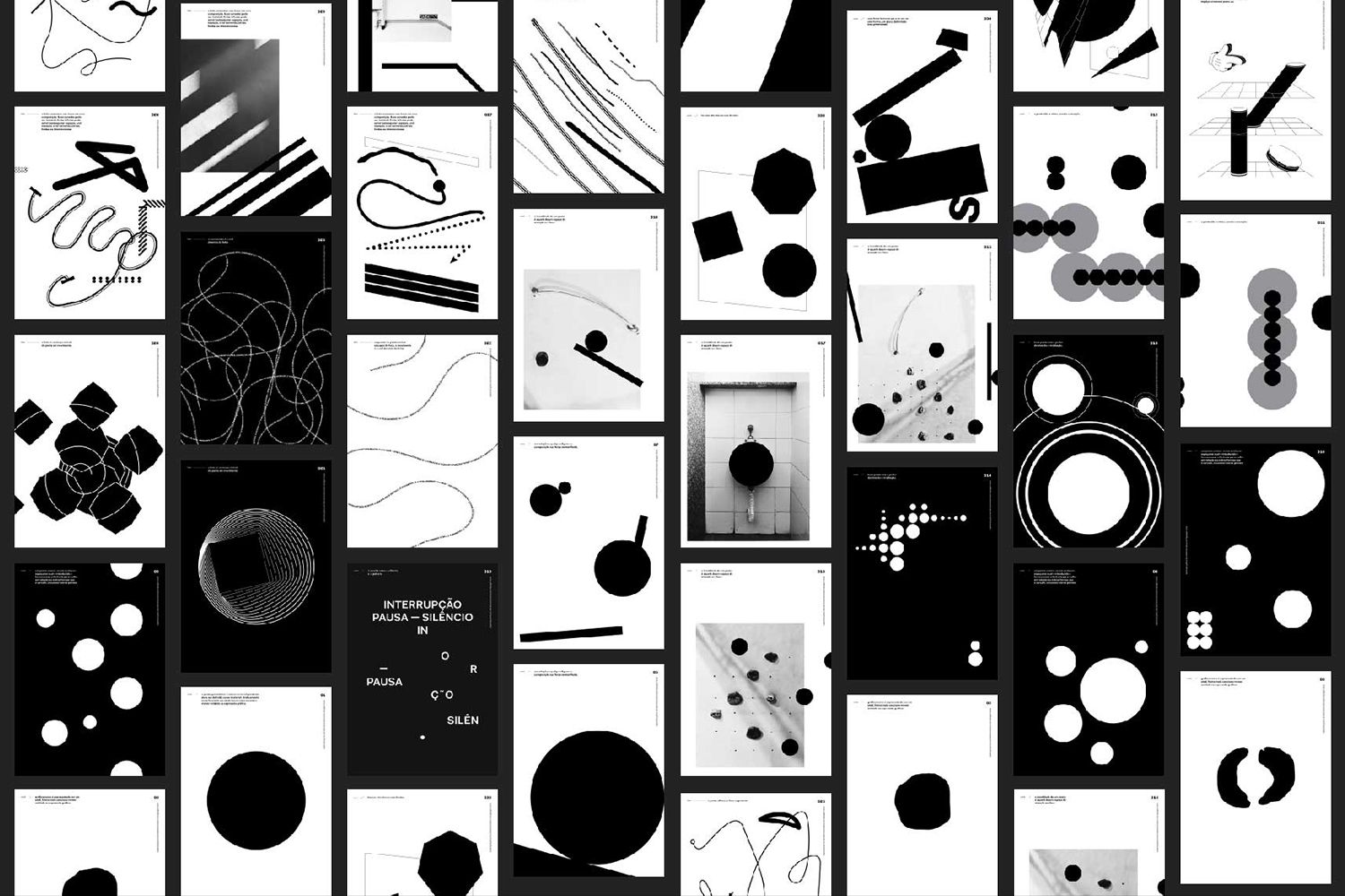
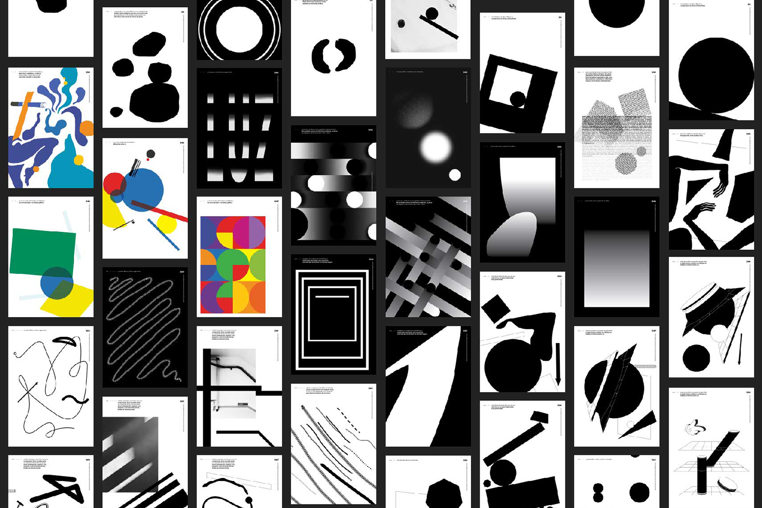
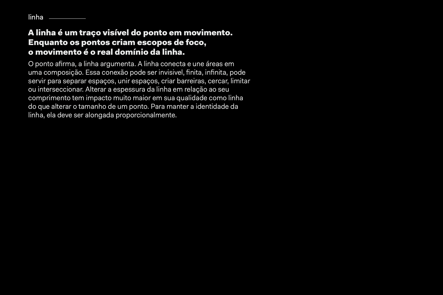
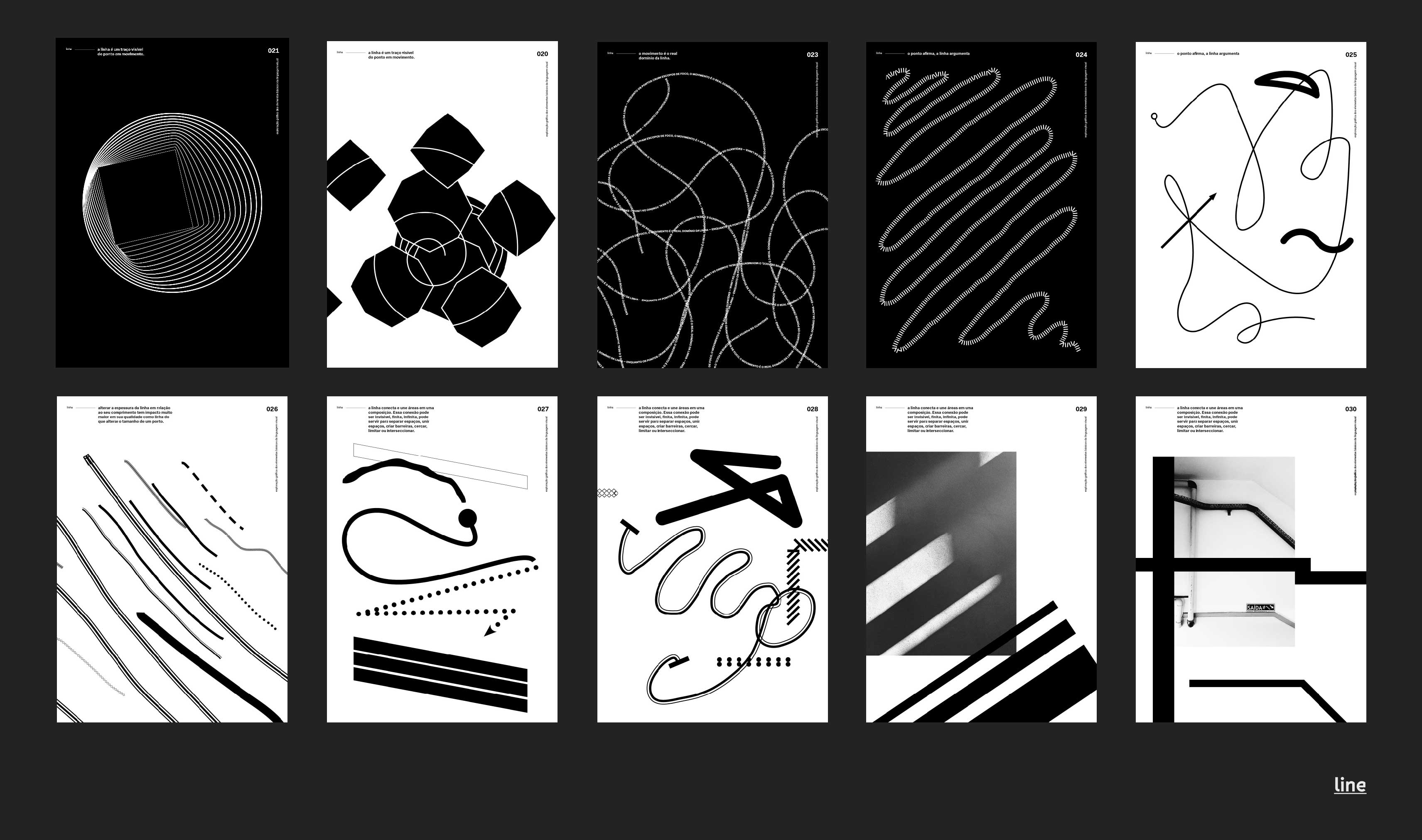
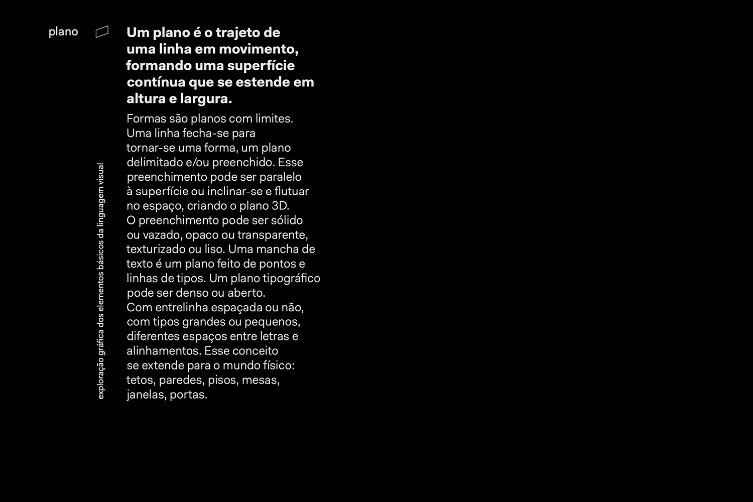
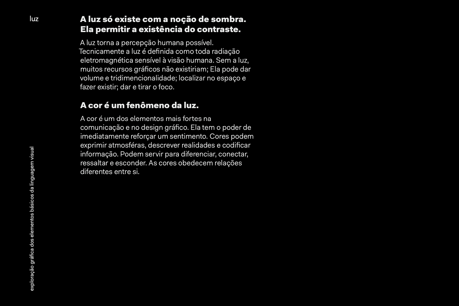
O projeto tem como produto final um conjunto de 50 cartazes que exploram as forças e características dos elementos básicos da linguagem visual. Na linguagem verbal, precisamos conhecer as noções básicas da gramática e sintaxe para transmitir uma mensagem. Na comunicação gráfica não é diferente.
Os elementos e princípios básicos da linguagem visual são os recursos que dão o vocabulário para dar voz ao designer. Tendo esse pensamento como princípio, o projeto define o ponto, a linha, o plano e a luz como os elementos fundamentais da linguagem visual. O conceito de cada cartaz é uma transcrição não literal de renomados autores, como Kandisky e Armin Hofmann. Seguindo o critério de ordenação pela sequência de frases/cartazes, origina-se uma narrativa para cada elemento e possibilita o entendimento individual de cada cartaz.